| Author | Thread |
|
|
10/30/2006 08:58:07 PM |
Greetings from the Critique Club.
Hi Shannon,
I first stumbled across your profile a few weeks ago and liked what I saw. Again I like what I see, and personally find the score surprisingly low. This is pretty much the case with lots of your images so I guess I just like your work.
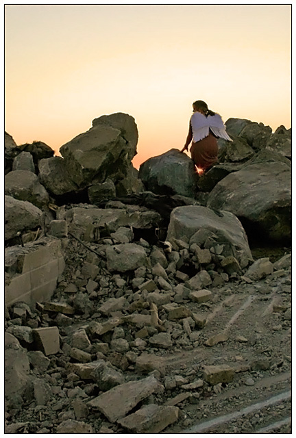
I've spent a bit of time looking at this shot trying to work out why it got so many flat 5's with such beautiful soft orange light. I've come up with two possible ideas. The first is that the image doesn't teally convey 'soft rock', the rocks actually look hard and substantial. The light above them is soft, but I reckon some people figured there is nothing in that. The main subject is the women with the wings - without the title the rock just seems to occupy a lot of pixels with dull colours. This brings me on to the second point - composition. I would have like the 'angel' in the bottom-right corner of the rule of thirds with loads of the glorious sky above her. That would have been a very effective shot (but still wouldn't have conveyed your oxymoron). As Dr Achoo said - it is not the best representation of the concept.
It is my hope that these insights are helpful and constructive. Please feel free to PM me if you have any questions regarding this critique. And please remember to mark it "Helpful" if you found it so. Good luck with future challenges.
Cheers
Paul |
|
 Photographer found comment helpful. Photographer found comment helpful. |
Comments Made During the Challenge  |
|
|
10/22/2006 09:45:33 PM |
| Nice idea. A white dress would be better to match the white angel wings. A tighter crop would reduce the seeming clutter of the smaller rocks in the foreground and would be more effective. |
|
|
|
10/18/2006 10:10:50 PM |
| I like your composition but I would like to be able to see her a little better. I think the angel wings and the setting combined with your composition make for an interesting shot. |
|
| Photographer found comment helpful. |
|
|
10/18/2006 06:48:14 PM |
| interesting interpretation - but i love the image. 8 |
|
| Photographer found comment helpful. |
|
|
10/18/2006 05:37:34 PM |
Meets Challenge - 2
Lighting/Processing - 1
Composition - 1
Overall Impression - 1
"WOW" factor - 0
Score: 5 |
|
| Photographer found comment helpful. |
|
|
10/18/2006 12:53:56 PM |
| good oxymoron, poor representation. The composition isn't bad, although I think I would have gone with more sky and less rock. 4 |
|
| Photographer found comment helpful. |
|
|
10/18/2006 07:34:20 AM |
| Great idea! I like your lighting. Perhaps a standing position would be better. |
|
| Photographer found comment helpful. |
Home -
Challenges -
Community -
League -
Photos -
Cameras -
Lenses -
Learn -
Help -
Terms of Use -
Privacy -
Top ^
DPChallenge, and website content and design, Copyright © 2001-2025 Challenging Technologies, LLC.
All digital photo copyrights belong to the photographers and may not be used without permission.
Current Server Time: 03/12/2025 02:44:56 AM EDT.