| Author | Thread |
|
|
05/23/2008 11:56:25 AM |
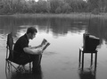
Creativity here is insanely awesome. Wish you would have scored better, but I have a feeling that the time for an image like this is coming soon!
You've come so far in photography since you took this shot that I a also willing to wager that a recreation of this shot from you would score much better than this one did.
Message edited by author 2008-05-23 11:57:59. |
|
 Photographer found comment helpful. Photographer found comment helpful. |
|
|
10/30/2006 12:35:51 AM |
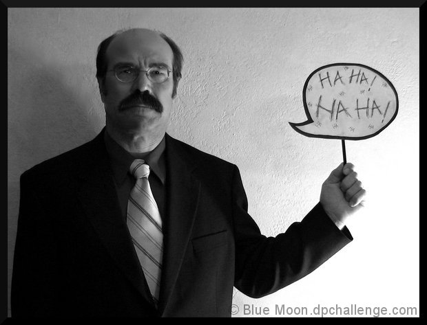
| I thought this was great - gave it a 7. :) |
|
| Photographer found comment helpful. |
Comments Made During the Challenge  |
|
|
10/24/2006 08:09:49 PM |
| Yes, very funny! I like it :) |
|
| Photographer found comment helpful. |
|
|
10/24/2006 06:54:41 PM |
| Hilarious! I think the only thing thats holding you back here is lighting. I would like to see his face better lit. His expression (and the creativity of this shot) are spot on! |
|
| Photographer found comment helpful. |
|
|
10/24/2006 07:43:44 AM |
| I think this one is my favourite out of the bunch, very well done. |
|
| Photographer found comment helpful. |
|
|
10/22/2006 10:14:55 PM |
| Nice composition. Lighting from below is a good choice for this oxymoron, but I think that light on the person would be better, rather than the wall behind the left hand. |
|
| Photographer found comment helpful. |
|
|
10/22/2006 09:37:33 PM |
|
| Photographer found comment helpful. |
|
|
10/22/2006 04:11:10 PM |
| Nice contrast, both in background/foreground brightness and in topic. That man is very serious! |
|
| Photographer found comment helpful. |
|
|
10/21/2006 01:18:54 AM |
| Funny. I think I'd like to see the sign a little closer to him and perhaps some more contrast. I guess that might have been hard considering how bright the right side is. |
|
| Photographer found comment helpful. |
|
|
10/20/2006 11:37:52 PM |
| LOL! I like the contrasts all over this shot: the ones for the title, the black jacket on the white wall, the light tie over the dark shirt ... |
|
| Photographer found comment helpful. |
|
|
10/20/2006 10:16:40 PM |
| Great concept, but I don't like the implementation. The lower right is completely blown out. Why you had him up against a wall I'm not sure because it's just boring. Maybe that's part of what you're trying to say. 5 |
|
| Photographer found comment helpful. |
|
|
10/20/2006 06:47:31 PM |
| Clever idea and the stone face he has is perfect! |
|
| Photographer found comment helpful. |
|
|
10/20/2006 09:23:46 AM |
|
| Photographer found comment helpful. |
|
|
10/19/2006 05:54:12 PM |
|
| Photographer found comment helpful. |
|
|
10/19/2006 05:14:44 PM |
| Oh well done, very good thinking... |
|
| Photographer found comment helpful. |
|
|
10/19/2006 10:40:23 AM |
| Model and lighting convey seriousness very well. He is holding up that goofy sign os very, very seriously. The best photos in this competition, and there are precious few, convey an oxymoron visually, as you do here. |
|
| Photographer found comment helpful. |
|
|
10/19/2006 06:32:18 AM |
| Original! I'm seeing some noise but I know that's a hazard of basic editing rules. |
|
| Photographer found comment helpful. |
|
|
10/19/2006 05:10:20 AM |
| it would have been better if the background had all been one shade, good luck anyway |
|
| Photographer found comment helpful. |
|
|
10/19/2006 03:19:05 AM |
Meets Challenge - 2
Lighting/Processing - 1
Composition - 2
Overall Impression - 1
"WOW" factor - 0
Score: 6 |
|
| Photographer found comment helpful. |
|
|
10/18/2006 10:10:26 PM |
| As a picture I think it could use a bit more light on the right side (our left) of his face. But his expression and the sign make me laugh. I gots to give you a high score. |
|
| Photographer found comment helpful. |
|
|
10/18/2006 01:01:44 PM |
| Very cool and very humorous ;-) The left side is a bit dull but it kinda suits the expression on the man's face. Every time I look at it I start to laugh so a bonus point for that. |
|
| Photographer found comment helpful. |
|
|
10/18/2006 05:12:03 AM |
|
| Photographer found comment helpful. |
|
|
10/18/2006 01:04:24 AM |
| Man I really like the idea of this and the setup...love his look...wonderful other than the lighting...just a straight forward lighting would have worked for this to take away both the blown highlights at the bottom right and shadow to the left. Again this is a very creative shot and I still give you a 8 for this challenge. |
|
| Photographer found comment helpful. |
|
|
10/18/2006 12:49:29 AM |
This is a neat idea.
I'm fond of photos like this.. artistic and even a bit strange.
Good shot. |
|
| Photographer found comment helpful. |
|
|
10/18/2006 12:47:23 AM |
|
| Photographer found comment helpful. |
Home -
Challenges -
Community -
League -
Photos -
Cameras -
Lenses -
Learn -
Help -
Terms of Use -
Privacy -
Top ^
DPChallenge, and website content and design, Copyright © 2001-2025 Challenging Technologies, LLC.
All digital photo copyrights belong to the photographers and may not be used without permission.
Current Server Time: 03/12/2025 03:52:45 PM EDT.