| Author | Thread |
Comments Made During the Challenge  |
|
|
10/14/2003 05:16:07 PM |
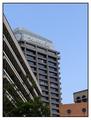
| Good landscape, I like the buildings. |
|
 Photographer found comment helpful. Photographer found comment helpful. |
|
|
10/14/2003 10:44:44 AM |
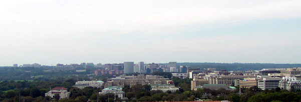
| A nice shot overall but for me personally it conveys more landscape than urban, not a balance of both. If the cropping was a little tighter maybe and a bit less sky? Also ithe horizon looks very washed out on my monitor but the right lower half side is very clear and crisp compared to the rest of the shot. |
|
| Photographer found comment helpful. |
|
|
10/12/2003 11:23:23 PM |
| I would have cropped out more of the non-interesting sky. |
|
| Photographer found comment helpful. |
|
|
10/10/2003 05:31:35 PM |
| a little red roof left at the bottom right after your crop detracts a bit, where is this? |
|
| Photographer found comment helpful. |
|
|
10/10/2003 03:54:01 AM |
| fits the challenge dead-on, but not very interesting to look at for long periods. no strong subject in photo to pay attention to. |
|
| Photographer found comment helpful. |
|
|
10/09/2003 12:01:31 PM |
| I find everything too distant |
|
| Photographer found comment helpful. |
|
|
10/08/2003 05:38:32 PM |
| It's a well taken photo ... but I think the composition could be more striking. |
|
| Photographer found comment helpful. |
|
|
10/08/2003 02:51:40 PM |
| No discernable subject unfortunately, and the sky is a bit blank. |
|
| Photographer found comment helpful. |
|
|
10/08/2003 11:39:21 AM |
| The horizon is to centered for my taste. I personaly would have liked to see more of the city. |
|
| Photographer found comment helpful. |
Home -
Challenges -
Community -
League -
Photos -
Cameras -
Lenses -
Learn -
Help -
Terms of Use -
Privacy -
Top ^
DPChallenge, and website content and design, Copyright © 2001-2025 Challenging Technologies, LLC.
All digital photo copyrights belong to the photographers and may not be used without permission.
Current Server Time: 03/12/2025 10:10:25 PM EDT.