| Author | Thread |
|
|
10/15/2003 02:58:15 AM |
| Hey Pam, its good to see you entering again. I often check your profile to see how you do :) |
|
Comments Made During the Challenge  |
|
|
10/14/2003 10:40:16 AM |
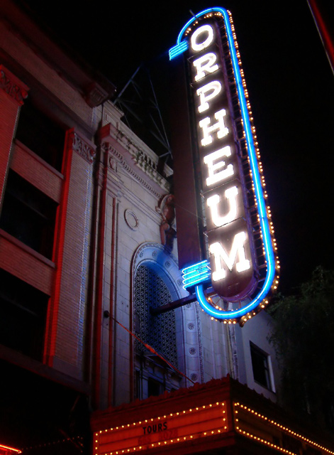
| This really does convey a sense of urban to me but something about the shot kept putting me off, couldn't quite place my finger on it until I took a little more time to really examine it. I think it the balance of light to the bottom marque. Maybe if the cropping was just slightly different, less of the bottom marque it would be so distracting. I like the shot, a tad more sharpness would score you another point, but it's going up 4 points now. |
|
 Photographer found comment helpful. Photographer found comment helpful. |
|
|
10/13/2003 11:26:52 PM |
| Your idea is creative and you managed to catch the aura of this building with very little of it showing. I like the perspective and the colors. |
|
| Photographer found comment helpful. |
|
|
10/13/2003 06:38:39 PM |
| Good capture, I like the colors. |
|
| Photographer found comment helpful. |
|
|
10/12/2003 06:09:07 PM |
| Cool shot! Like the prespective and the look of the sign. The roundness is nice. Not a typical square sign. Nice colors, too. |
|
| Photographer found comment helpful. |
|
|
10/08/2003 10:04:01 PM |
| The building makes a great canvas for the colored lights. Nice shot. |
|
| Photographer found comment helpful. |
|
|
10/08/2003 04:06:25 AM |
| Great work, fits the theme well. 8 Morgan |
|
| Photographer found comment helpful. |
|
|
10/08/2003 12:35:47 AM |
|
| Photographer found comment helpful. |
Home -
Challenges -
Community -
League -
Photos -
Cameras -
Lenses -
Learn -
Help -
Terms of Use -
Privacy -
Top ^
DPChallenge, and website content and design, Copyright © 2001-2025 Challenging Technologies, LLC.
All digital photo copyrights belong to the photographers and may not be used without permission.
Current Server Time: 03/13/2025 04:06:19 AM EDT.