| Author | Thread |
Comments Made During the Challenge  |
|
|
08/11/2002 09:22:00 PM |
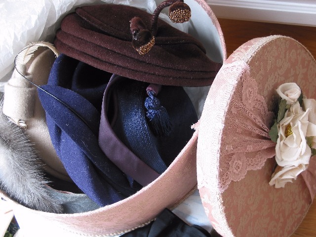
| Nice idea... don't really like the composition... can't really see enough of the hats 4 sjgleah |
|
|
|
08/11/2002 05:10:00 PM |
| This appeals to me. I used to collect vintage hats...and gloves, and dresses, and purses...lol You name it I collected it. Now I have limited it to purses and sold the rest on ebay. I like the composition and the lighting. If I had to pick something I didn't like, I'd ditch the white tissue paper in the upper left corner that sort of draws my eye to it. I like the curves of the box, lid, and hats. The window sill detracts a bit, and the clutter between the box and lid on the bottom, near the center also is a distraction. Those few complaints keep it from being perfect. All in all I like it. |
|
|
|
08/10/2002 01:45:00 PM |
| Nice idea. Need to lose the skirting board at the top right and the tissue paper at top left is reflecting too much white light. |
|
|
|
08/08/2002 08:26:00 AM |
| nice colors... excellent composition :) - jmsetzler |
|
|
|
08/08/2002 07:06:00 AM |
| Good choice of subject and lighting. Framing was pretty good but I think I'd like to have seen just a bit more of the hats. |
|
|
|
08/06/2002 10:34:00 PM |
| lovely assortment..good composition..good colord and texture |
|
|
|
08/06/2002 03:19:00 PM |
| A little too bright in the lower left, and on top of the hat box lid, but you ahve shown the details nicely, and i like the colors. karmat |
|
|
|
08/05/2002 09:37:00 PM |
Something old. Use your photographic technique to emphasize the age of your subject.
Composition - Quite good
Technical Aspects - quite good
Meets Challenge - yes
Visual Impact / Originality - good
Perhaps a little busy.
|
|
|
|
08/05/2002 08:31:00 PM |
|
|
|
08/05/2002 07:52:00 PM |
| Nice old hats. I fault the picture because of the blowout in the foreground. The diagonal line in the top right is distracting also. If this were taken in indirect light it would be a 1000 times better. Autool |
|
|
|
08/05/2002 02:07:00 PM |
| Nice photo, but a plain background would have been nicer. Also too much lighting from the left. |
|
|
|
08/05/2002 01:17:00 PM |
| they're a little too squashed together for me to see them well and appreciate them |
|
|
|
08/05/2002 10:29:00 AM |
| i'd like to see women start wearing hats all the time |
|
Home -
Challenges -
Community -
League -
Photos -
Cameras -
Lenses -
Learn -
Help -
Terms of Use -
Privacy -
Top ^
DPChallenge, and website content and design, Copyright © 2001-2025 Challenging Technologies, LLC.
All digital photo copyrights belong to the photographers and may not be used without permission.
Current Server Time: 03/13/2025 05:57:40 AM EDT.