| Author | Thread |
Comments Made During the Challenge  |
|
|
08/11/2002 08:37:00 PM |
| Being a nurse myself I love this subject, did you intentionally want the paper to look folded? I would have placed it under a sheet of non reflective glass to flatten it first, but that's just me. |
|
|
|
08/11/2002 05:41:00 PM |
| Meets the challenge but is not crystal clear, which is important if you want to read the document. Artistically it lacks since it is a document. |
|
|
|
08/10/2002 09:47:00 PM |
| I guess I see the reference to "old" but the picture is rather uninspired. 3 Jak |
|
|
|
08/09/2002 10:30:00 PM |
| I think if you could have had a way to display this a little differently, it would have made more impact. karmat |
|
|
|
08/08/2002 12:48:00 PM |
| Nice subject -- if you were to apply a bit of sharpening, the detail in the lettering would be more defined and easier to read. |
|
|
|
08/08/2002 05:39:00 AM |
| Unfortunatly, many modern documents are done in the same olde worlde florid style, so the subject doesnt actually look old. Not sure I like the cropping either. Try upping the contrast, and see if that improoves things. |
|
|
|
08/07/2002 02:19:00 PM |
| Definitely old. Not terribly evocative, though. more like a statement. |
|
|
|
08/06/2002 03:33:00 PM |
| Crop may be a little too tight. Brighten it up a bit or play with the levels to make the black/white more contrasty. |
|
|
|
08/06/2002 10:58:00 AM |
| why shoot this in black & white? |
|
|
|
08/06/2002 08:41:00 AM |
| What a great subject for this challenge - I also like the way we can see the creases in this old document. The contrast is a little low and focus is a shade off on the left but other wise it's a great shot. |
|
|
|
08/05/2002 09:29:00 PM |
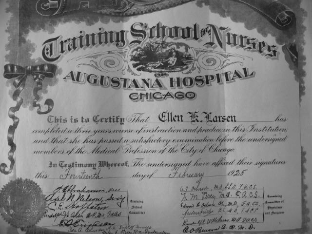
Something old. Use your photographic technique to emphasize the age of your subject.
Composition - quite good
Technical Aspects - quite good
Meets Challenge - yes
Visual Impact / Originality - good
|
|
|
|
08/05/2002 09:11:00 PM |
|
|
|
08/05/2002 09:00:00 PM |
| This would have been super if you could have incorporated in with some additional nurses props from the era. This would have given it the interest to keep one looking. In my opinion any way. Autool |
|
|
|
08/05/2002 02:42:00 PM |
| Definitely old...but I'd prefer to see the color version... |
|
|
|
08/05/2002 01:25:00 PM |
| If you're Ellen Larsen, you should be proud. However, photographic image is only of the paper. If your picture was on a wall, of in a case or something to show texture or wear it would be more interesting |
|
|
|
08/05/2002 01:18:00 PM |
| a little more thought into layout and creating a still life, perhaps? The date would've been hard to read, but it would hold the viewer's interest more. |
|
|
|
08/05/2002 11:24:00 AM |
| This is definitely old :) The photogrpahic value is not very strong though.. This photo shows that you are in posession of an old artifact, but the photo itself doesn't hold much artistic value... - jmsetzler |
|
|
|
08/05/2002 10:22:00 AM |
| The creases are very distracting. |
|
|
|
08/05/2002 09:14:00 AM |
| Looks a little muddy,punching up the contrast would help. |
|
|
|
08/05/2002 01:03:00 AM |
| The lettering looks a bit blurry...but that could be me. |
|
Home -
Challenges -
Community -
League -
Photos -
Cameras -
Lenses -
Learn -
Help -
Terms of Use -
Privacy -
Top ^
DPChallenge, and website content and design, Copyright © 2001-2025 Challenging Technologies, LLC.
All digital photo copyrights belong to the photographers and may not be used without permission.
Current Server Time: 03/12/2025 08:48:14 AM EDT.