| Author | Thread |
|
|
08/13/2002 01:45:00 AM |
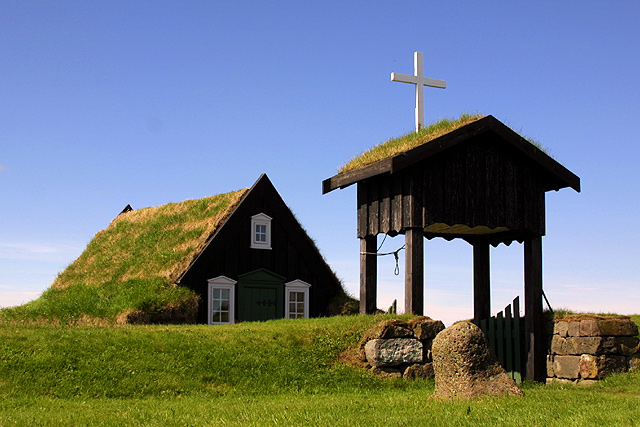
| AHA! I thought this looked like something I've seen in Sweden. Iceland is close though! Very pretty. I like the lines and color. I think you deserved an even higher score. My only suggestion would have been trying it under different, less harsh lighting so that you could expose the shadow areas a little better. |
|
Comments Made During the Challenge  |
|
|
08/11/2002 09:47:00 PM |
| I really like the colors and thte composition... 7 sjgleah |
|
|
|
08/11/2002 07:08:00 PM |
Something old. Use your photographic technique to emphasize the age of your subject.
Composition - quite good
Technical Aspects - quite good
Meets Challenge - maybe. I don't get a good feeling of old here
Visual Impact / Originality - good
|
|
|
|
08/11/2002 04:55:00 PM |
| This looks like Iceland to me, beautiful shot, one of my top three. If this is arnit, I really like the outtake of the two ladies and the sheep, belongs in National Geographic! |
|
|
|
08/11/2002 11:02:00 AM |
| haven't we seen this before ? :) |
|
|
|
08/10/2002 05:06:00 PM |
| I liked it the other time too, Arnit. Do you mow often? I wonder what time of day it is and how it would look with more light on the front. Nice job though. |
|
|
|
08/10/2002 03:43:00 PM |
| Last time we saw this, wasn't there some obstruction in the background? This must be near your home..................... I likes the simplicity of the sky and the green turf, white windows and cross as accents. I give it a 10 |
|
|
|
08/10/2002 09:44:00 AM |
| If the picture were darker or maybe if you dulled the colors more it would add more of an old feel to it. Good setting though |
|
|
|
08/09/2002 02:33:00 PM |
| outstanding photo, technically. Exactly the kind of shot I would love to make. Strangely, because the colors are so vivid, the feeling of oldness is suppressed, and that works a tiny bit against my rating of this one. |
|
|
|
08/09/2002 10:24:00 AM |
Are you the one who shot this for architecture? I like it better in color. ;)
Composition good, love the grass on the roofs, colors and brightness, and clarity all very good. |
|
|
|
08/09/2002 02:49:00 AM |
| beautiful. where is that? one of my top 3s for the week. |
|
|
|
08/08/2002 10:57:00 PM |
| wonderfully composed with a diagonal up and across, while the rock in the foreground keeps you firmly planted on the ground |
|
|
|
08/08/2002 01:51:00 PM |
|
|
|
08/08/2002 10:20:00 AM |
| Crisp and vivid ... an original way to show something old. Beautiful! 9! sylk |
|
|
|
08/08/2002 10:07:00 AM |
| what a superb location and nicely shot! Texture, color and composition are all exceedingly well-done. |
|
|
|
08/08/2002 01:54:00 AM |
| This is a very peaceful place. I would like very much to go here one day. A very nice picture. |
|
|
|
08/07/2002 11:24:00 AM |
| Turf roofs? Must be Iceland, must be Arni. This may become this weeks winner, but I think you've sold out this week. Please get back to giving your adoring public a masterclass in use of DOF and negative space. |
|
|
|
08/07/2002 10:17:00 AM |
| I love the occasional opportunity to revisit a place that I have 'been' before... I remember this photo from the Architecture challenge... This image is just as nice :) If this is Arni, are you working on a seasonal series? If so, excellent subject matter... great photo... good work :) - jmsetzler |
|
|
|
08/07/2002 08:00:00 AM |
| A very interesting structure with the grass roofs. |
|
|
|
08/07/2002 06:36:00 AM |
| Nice uncluttered composition. |
|
|
|
08/07/2002 12:25:00 AM |
| wow, we're not in Kansas anymore Toto. - this is beautiful. 10 |
|
|
|
08/06/2002 11:59:00 PM |
| good composition ...good play of angles |
|
|
|
08/06/2002 11:30:00 PM |
| No suggestions for improvement. This is awesome! like the contrasting colors and the way you have framed it. Very nice. karmat |
|
|
|
08/06/2002 10:33:00 PM |
| beautiful shot. I love the composition as it is but would still like to see the rest of the house. Incredible color...great dof. One of my favorites. 9 Lisa |
|
|
|
08/06/2002 04:00:00 PM |
| Even though I would hate for you to place again with the same basic image I still like the shot. 10-2 for not giving me a different angle....8 |
|
|
|
08/06/2002 02:56:00 PM |
| Really cool church. I'd like to see more shots of the location. |
|
|
|
08/06/2002 02:28:00 PM |
|
|
|
08/06/2002 01:53:00 PM |
|
|
|
08/06/2002 11:56:00 AM |
| Absolutly beautiful!!! Great picture!!! |
|
|
|
08/06/2002 10:41:00 AM |
| Really nice. Using the clear blue sky to fill most of the frame along with the strong sidelit greens gives it a quiet, peaceful feel. The dark shadows created by the sidelighting on the house and especially the entryway help make the subject stand out. If only the distant cloucover had been less to create a more stark contrast where the grass meets the blue sky instead of white, but that's a minor quibble for me. Great job. |
|
|
|
08/06/2002 08:48:00 AM |
| Looks like it might be arnit's entry. As always your focus, contrast and colour are all superb and the real kicker is that you have such wonderful and unusual (to us) scenery to work with. Excellent shot. |
|
|
|
08/06/2002 03:39:00 AM |
| This looks fimiliar except more green than white |
|
|
|
08/06/2002 03:05:00 AM |
| Looks even better than it did in winter when I gave it a 10 as well. |
|
|
|
08/06/2002 12:02:00 AM |
Man....it's like the religious version of the teletubbies....ahhhh
nice shot ;) |
|
|
|
08/05/2002 09:57:00 PM |
|
|
|
08/05/2002 05:13:00 PM |
| I liked it, and I know this might be an old construction, but to me, it doesn't look old. |
|
|
|
08/05/2002 03:30:00 PM |
| calendar quality and I mean it as a compliment |
|
|
|
08/05/2002 03:07:00 PM |
| This looks familiar. :-) Great shot 7 |
|
|
|
08/05/2002 02:16:00 PM |
| Clean, crisp...great colors! |
|
|
|
08/05/2002 01:46:00 PM |
|
|
|
08/05/2002 12:23:00 PM |
| The detail and color are amazing. The subject is also great |
|
|
|
08/05/2002 11:11:00 AM |
| The color in the sky is great. Also why us there grass growing ont he roofs?? My guess is that it is a very old Thatch roof. |
|
|
|
08/05/2002 09:54:00 AM |
| This is a great pix.The only thing that I can say is bad is the shadows on the right structure are blocked up( detail is lost in the darkplaces) and thats minor in this pix. |
|
|
|
08/05/2002 09:39:00 AM |
| Nice photo. I would have converted it to black and white. Then the photo would actually look old. The very saturated colors are somehow a contradiction here. |
|
|
|
08/05/2002 09:20:00 AM |
| haha..hey, that looks familiar! :P |
|
|
|
08/05/2002 01:52:00 AM |
| Good composition, and color. Very effective. |
|
Home -
Challenges -
Community -
League -
Photos -
Cameras -
Lenses -
Learn -
Help -
Terms of Use -
Privacy -
Top ^
DPChallenge, and website content and design, Copyright © 2001-2025 Challenging Technologies, LLC.
All digital photo copyrights belong to the photographers and may not be used without permission.
Current Server Time: 04/26/2025 05:43:18 PM EDT.