| Author | Thread |
Comments Made During the Challenge  |
|
|
10/31/2006 08:07:50 AM |
| I think you should improve the deep of field. |
|
|
|
10/31/2006 12:33:49 AM |
Meets Challenge - 2
Lighting/Processing - 1
Composition - 1
Overall Impression - 1
"WOW" factor - 0
Score: 5 |
|
|
|
10/28/2006 01:32:37 PM |
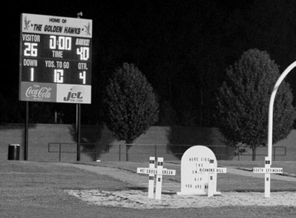
| That's an interesting concept for stats! Very interesting photo. B&w works well, but having an issue with the arch thing to the right. It's sprouting out of the cross. Perhps a bit of an different aspect for this. (You lower and to the right a bit.) |
|
|
|
10/28/2006 11:13:45 AM |
| sharper focus could have improved this picture a lot. |
|
|
|
10/28/2006 01:49:20 AM |
| Nice markers and composition. Just wish that it were sharper, did you not use a tripod for low light, allowing better ISO, less noise, etc. |
|
|
|
10/27/2006 09:01:24 PM |
| Cute idea, nice shot. The shot seems to need a bit more contrast but that's just a matter of personal taste. The back end of the goal post is distracting but understandably avoidable in the image. |
|
|
|
10/27/2006 01:58:34 PM |
| Nice job getting a true after the game image. I like the conversion - it focuses on the geme information (vs. I'd imagine a rather colorful scoreboard). |
|
|
|
10/27/2006 11:39:05 AM |
| cool concept but out of focus |
|
|
|
10/27/2006 10:13:56 AM |
|
|
|
10/27/2006 05:01:55 AM |
|
|
|
10/26/2006 10:18:11 PM |
| well...not expecting this.. |
|
|
|
10/26/2006 03:01:59 PM |
| lol that is different, not sure I've ever seen that before, but should it makes sense! A blow out for the visitors. |
|
|
|
10/25/2006 11:17:53 PM |
| The blurring on the tombstones and in general hurt this shot...good idea...weak shot, |
|
|
|
10/25/2006 07:11:59 PM |
Meets Challenge: 10
Lighting/Processing: 3 (lack of contrast, soft)
Composition: 4
Overall Impression: 3
"WOW" factor: 1
Average Score: 4.2 |
|
|
|
10/25/2006 06:23:22 PM |
| sweeeeeeet, morbid, but sweeeeeet, a 10 just since you had the nerve to use this i like your style! good luck!!!!! |
|
|
|
10/25/2006 05:45:50 PM |
| Good concept but not knowing the custom with the graves at a sportsfield I'd like to be able to read them to understand. Cropping out the tall thing at the right would remove that as a distracting feature but still leave the crosses: 6 |
|
|
|
10/25/2006 01:54:47 PM |
| That's a very cool and fun idea this school has. :) The image is fun because of the subject. It's a bit grainy and seems a little fuzzy. Were you using a tripod for this? Anyway. Good luck in the challenge. |
|
|
|
10/25/2006 03:29:14 AM |
| overall score: comp-1 (everything is in frame, but the view is plain, I need more interesting angle), MC-2, PP-0 (i'd add sharpness and contrast, and lighten this uninformative black on the background), impression-0, wow-0 = 3. sorry. |
|
|
|
10/25/2006 02:36:12 AM |
Is that an oxymoron? I mean, that's a very funny composition and yet it's a graveyard.
Anyway, interesting idea. I'd like to see the scoreboard more on focus, though. |
|
Home -
Challenges -
Community -
League -
Photos -
Cameras -
Lenses -
Learn -
Help -
Terms of Use -
Privacy -
Top ^
DPChallenge, and website content and design, Copyright © 2001-2025 Challenging Technologies, LLC.
All digital photo copyrights belong to the photographers and may not be used without permission.
Current Server Time: 03/12/2025 08:07:22 AM EDT.