| Author | Thread |
|
|
11/01/2006 07:07:11 PM |
| Nice DOF! And nice lighting too! |
|
 Photographer found comment helpful. Photographer found comment helpful. |
|
|
11/01/2006 08:47:08 AM |
| i liked the lighting inthis alot. my top picks were not even in the top 10 so i guess i am not in sync with dpc voters. |
|
| Photographer found comment helpful. |
Comments Made During the Challenge  |
|
|
10/30/2006 10:22:34 PM |
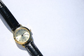
| Nice use of DOF. How many times do you see a cap, glove or item left behind. Nice job. |
|
| Photographer found comment helpful. |
|
|
10/28/2006 01:33:35 PM |
| Interesting lighting, good dof. |
|
| Photographer found comment helpful. |
|
|
10/27/2006 06:10:25 PM |
| This is a good concept but the image feels very cramped. I'd prefer to see more of the outside area around the cap...as it is, it feels very cut-off and crowded. |
|
| Photographer found comment helpful. |
|
|
10/27/2006 09:52:26 AM |
Meets Challenge - 2
Lighting/Processing - 2
Composition - 1
Overall Impression - 2
"WOW" factor - 0
Score: 7 |
|
| Photographer found comment helpful. |
|
|
10/27/2006 05:02:52 AM |
|
| Photographer found comment helpful. |
|
|
10/27/2006 04:52:29 AM |
| why is the hat cut off the bottom there? A "whole" hat would have been better no? |
|
| Photographer found comment helpful. |
|
|
10/26/2006 08:44:36 PM |
| A good shot of a common theme. This is nice in that the hat is the subject but the OOF background is composed in a way that is interesting without taking away from the hat: 8 |
|
| Photographer found comment helpful. |
|
|
10/25/2006 07:45:55 PM |
| Nice composition. Flat lighting. Lighting, unfortunately, often trumps composition. 5 |
|
| Photographer found comment helpful. |
|
|
10/25/2006 01:18:51 PM |
0-2 meets challenge = 2
0-3 creativity = 2
0-3 technical merit = 2
0-2 biased wow factor = 0
Total = 6
Would have liked to see more of the empty field. |
|
| Photographer found comment helpful. |
|
|
10/25/2006 11:13:43 AM |
| This is kind of what I envisioned when the challenge came up, or empty bleachers with debris, etc... That's just me however. :D Photo wise, it's "ok". Looks like it could use a little more contrast and some color saturation. I like how you've positioned the hat in your image. Good luck in the challenge. |
|
| Photographer found comment helpful. |
Home -
Challenges -
Community -
League -
Photos -
Cameras -
Lenses -
Learn -
Help -
Terms of Use -
Privacy -
Top ^
DPChallenge, and website content and design, Copyright © 2001-2025 Challenging Technologies, LLC.
All digital photo copyrights belong to the photographers and may not be used without permission.
Current Server Time: 03/12/2025 02:43:41 AM EDT.