| Author | Thread |
|
|
08/12/2002 09:01:00 AM |
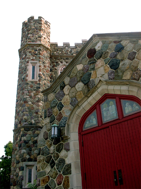
| Once again, thanks for commenting everyone! I would have loved to have this picture of an OLD(yes, its old) CHURCH with a blue sky but the angle of the sun at that time of day ruins it. Oh well. I just keep picking up new ways to improve my pictures. Even though my current picture isnt doing well, hopefully my pencil will. Hopefully. :0 ) |
|
Comments Made During the Challenge  |
|
|
08/11/2002 05:20:00 PM |
| Great shot. The only suggestion I have is maybe the shot coud have been taken to capture more of the building. Or cropped to keep out the sky. The sky is a bland and distracts from the building. If the sky was blue with poofy clouds it would have fit in better. |
|
|
|
08/10/2002 01:31:00 PM |
|
|
|
08/10/2002 12:20:00 PM |
Something old. Use your photographic technique to emphasize the age of your subject.
Composition - good. The angles bother me a little
Technical Aspects - quite good
Meets Challenge - yes
Visual Impact / Originality - good
|
|
|
|
08/09/2002 07:47:00 PM |
| there are a lot of features I like about this photo--colors, subject, clarity, but the opposing angles distract me. I also wonder what the sky was like. It is nice though---8 |
|
|
|
08/09/2002 07:54:00 AM |
| Looks pretty nice and new to me. Nice photo though. |
|
|
|
08/08/2002 02:33:00 PM |
| very nice texture in this photo... i have a personal issue... it's just my own preference, but i have a hard time with photos that show a large section of a door that don't show where it meets the ground... it's just an aesthetical thing... I need to have some sort of 'path' to that door :) good work otherwise :) = 7 - jmsetzler |
|
|
|
08/07/2002 04:01:00 PM |
| I like the color in this. |
|
|
|
08/07/2002 03:39:00 PM |
|
|
|
08/07/2002 02:44:00 PM |
| Perspective may have been batter a little back. This would have allowed you to shoot aiming more out of line with the light source, and might have prevented the bloom over the roof edge. |
|
|
|
08/06/2002 10:44:00 PM |
| I really like hte red door. Very nice picture and I like the perspective. The sky is a little blown out at the upper right, and I only notice it because it seems to make the details up there disappear. Still an awesome shot, I think. karmat |
|
|
|
08/06/2002 09:21:00 PM |
| I like the view as composed, but get hung up on the angle of the red door -Vs- the angle of the tower. For me they create a tension that might not be present if composed from a different angle. One suggestion would be if possible, to use more telephoto and get farther back. This will compress the image and give a bit more emphasis to the tower. If I'm not mistaken, it will also lessen the difference between the angles of these two elements. |
|
|
|
08/06/2002 05:07:00 PM |
| It looks kinda new to me. But interesting contrast w/ the door. Overall kinda bland photo. |
|
|
|
08/06/2002 02:04:00 PM |
| I think this would have been a good one for the Texture challenge. It works great for this challenge also. I used to do stone fireplaces and can apreciate how much work a whole church would be. |
|
|
|
08/05/2002 02:40:00 PM |
| I sure would like to know where this is....it looks familiar. |
|
|
|
08/05/2002 11:53:00 AM |
| I bet someone will say "This would be great with NICE BLUE SKY" pay no attention to them ,, I like it just the way it is. |
|
|
|
08/05/2002 08:22:00 AM |
| I would have liked it more with a dramatic sky. The composition seems a bit cramped too, sorry(4) Perhaps having the whole building visible would have helped... |
|
|
|
08/05/2002 08:01:00 AM |
|
Home -
Challenges -
Community -
League -
Photos -
Cameras -
Lenses -
Learn -
Help -
Terms of Use -
Privacy -
Top ^
DPChallenge, and website content and design, Copyright © 2001-2025 Challenging Technologies, LLC.
All digital photo copyrights belong to the photographers and may not be used without permission.
Current Server Time: 03/12/2025 12:20:46 PM EDT.