| Author | Thread |
Comments Made During the Challenge  |
|
|
10/19/2003 12:52:59 PM |
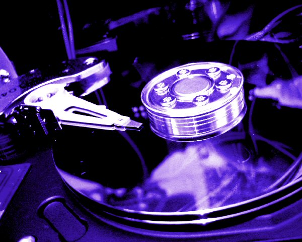
| Good use of colour sets this shot apart from other shots of a similar subject. My only slight criticism would be the arm for the read head is overexposed, however this doesn�t seem to detract too much from the overall impact of the shot. Well done. |
|
 Photographer found comment helpful. Photographer found comment helpful. |
|
|
10/14/2003 12:12:24 PM |
| I like the composition here quite a bit. I like the 'technology' photos :) I also like the lighting here that seems to be harsh. This photo seems a bit unsharp but appears to have been slightly oversharpened in the process of trying to correct that... maybe.. dunno for sure... |
|
| Photographer found comment helpful. |
|
|
10/14/2003 02:00:50 AM |
|
| Photographer found comment helpful. |
|
|
10/14/2003 12:11:21 AM |
Excellent photo, I really like the reflections on the platter, and the colour you chose to make it.
being picky, the only things that I think could've improved it would've been softer light on the head, as there no definition in it as its too bright, and maybe have the disk running would've been worth a try. ----9 |
|
| Photographer found comment helpful. |
|
|
10/13/2003 03:37:52 PM |
| Quite a few harddrives in this challenge and the great part is everyone approached them differently! This is a wonderful shot, the sharpness is a bit much for me but the colors are wonderful. The arm seems a bit too bright but that is a bit of an advantage too as it keeps me in the shot and pulls me towards the center with it's line. Starting with an 8, I'll be back. |
|
| Photographer found comment helpful. |
|
|
10/13/2003 01:41:15 PM |
Ah, another hard drive open to the elements.
Nicely done good and obvious as what it is, not sure about the lighting effect but well done nontheless. |
|
| Photographer found comment helpful. |
|
|
10/13/2003 07:44:47 AM |
Good Points: like the bluey wash, best angle thus far for this common shot.
Bad Points: unoriginal idea, but the best out of the lot.
Score:7 |
|
| Photographer found comment helpful. |
|
|
10/13/2003 02:16:11 AM |
| Very much light the coloring of the photo. Normally however, the very white (blown out I think its called?) area would be very distracting to me, but with the richness in color and the very metallic look of the composition, I think it works - it wouldn't hurt if it were a little less glaring though. All in all, an excellent submission. 7 |
|
| Photographer found comment helpful. |
Home -
Challenges -
Community -
League -
Photos -
Cameras -
Lenses -
Learn -
Help -
Terms of Use -
Privacy -
Top ^
DPChallenge, and website content and design, Copyright © 2001-2025 Challenging Technologies, LLC.
All digital photo copyrights belong to the photographers and may not be used without permission.
Current Server Time: 04/02/2025 05:23:56 PM EDT.