| Author | Thread |
|
|
10/22/2003 09:01:55 PM |
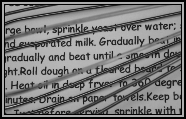
| I thought it was pretty obvious that was a whisk. Using a handwriting font might have looked good. |
|
|
|
10/22/2003 06:35:07 PM |
Hi Anna
One thing I've learned in photography is that an image has to be self-explanatory and the message or idea has to jump to the eyes of the viewers. It has to be extra obvious to be good. And I must tell you that I didn't get it it was a a whisk on top of the recipe. And I looked at it for quite a while unlike probably most of the voters... So you can bet probably a lot of them didn't get the idea behind this shot. And that's too bad because I think it was a good idea, but the realization could have been better.
Also, as pointed out in the comments, it would have been much better if the recipe was hand written. I guess you agree with that.
So, what would I have done to improve this shot: use a greater depth of field so that all the wires would have been in focus and maybe a slightly wider view. And I find it funny that you foresaw this critique: then how come you didn't took it into consideration? :)
To summarize: I think you had a good idea, but a little more commitment in taking this picture would have enhanced it greatly.
Keep it up, you have original and good ideas, that's half of the work!
Christophe, for The Critique Club. |
|
 Photographer found comment helpful. Photographer found comment helpful. |
Comments Made During the Challenge  |
|
|
10/18/2003 07:26:55 PM |
| To go along with your title, it would have been better had this been a handwritten recipe on worn paper, slightly faded over time and showing the spills a recipe would normally get. Your lighting is good - position in the frame is good - however you are not 'revealing' the subject - instead keeping it somewhat 'concealed'. |
|
| Photographer found comment helpful. |
|
|
10/16/2003 07:13:34 PM |
| is it a whisk over the print? it isn't clear to me and if it isn't a kitchen tool why is it there? |
|
| Photographer found comment helpful. |
|
|
10/14/2003 06:25:46 PM |
| HAHAHAH very cute idea!! Although, the beater may be a little blurry @ some areas! GREAT IDEA! VERY CUTE! KEEP IT UP! |
|
| Photographer found comment helpful. |
|
|
10/14/2003 02:52:51 PM |
| I like your idea here. The image seems to be about 1/3 or 1/2 stop underexposed... |
|
| Photographer found comment helpful. |
|
|
10/14/2003 11:48:03 AM |
| This is really creative and I like it a lot. Particularly like the pattern created by whisk. Border seems too heavy though. |
|
| Photographer found comment helpful. |
|
|
10/14/2003 08:03:32 AM |
| With a font like Comic, this can hardly be very old... The exposure through the whisk is a great idea, though! Very well captured. |
|
|
|
10/13/2003 01:46:17 PM |
| Grandma would have never used a word processor to jot down her recipe! ;) |
|
|
|
10/13/2003 05:30:59 AM |
Good points: none, sorry ;(
Bad points: messy idea, that is very dull
Score:1 |
|
|
|
10/13/2003 02:46:19 AM |
| Nice idea! I'm guessing that's a wire whisk over top, if so it helps tie the whole cooking aspect of the piece together as well as adding a bit of a covering/barrier as if to keep some of the recipe hidden, at least that's what I got from it. I tend to not like photos that are mostly words, but this one works well. 7 |
|
| Photographer found comment helpful. |
|
|
10/13/2003 02:09:48 AM |
| this would be more convincing as grandma's recipe if it were handwritten on aged paper instead of computer printed. also some more contrast/brightness to make the white pop out instead of being gray would help add interest. |
|
|
|
10/13/2003 12:36:51 AM |
| I'm betting this is for doughnuts!!!!!!!! A wonderful idea and the overall shot is well done. The cropping is great, the whisk's angle draws your eyes from right to left while the writing takes you left to right. The few fuzzy wires are a bit distracting and could be just a tad sharper and lighter. Starting with a 7, may go higher. |
|
| Photographer found comment helpful. |
Home -
Challenges -
Community -
League -
Photos -
Cameras -
Lenses -
Learn -
Help -
Terms of Use -
Privacy -
Top ^
DPChallenge, and website content and design, Copyright © 2001-2025 Challenging Technologies, LLC.
All digital photo copyrights belong to the photographers and may not be used without permission.
Current Server Time: 03/12/2025 03:33:37 PM EDT.