| Author | Thread |
|
|
11/09/2006 08:53:09 AM |
| An excellent entry - very good and interesting subject. |
|
Comments Made During the Challenge  |
|
|
11/07/2006 05:57:49 AM |
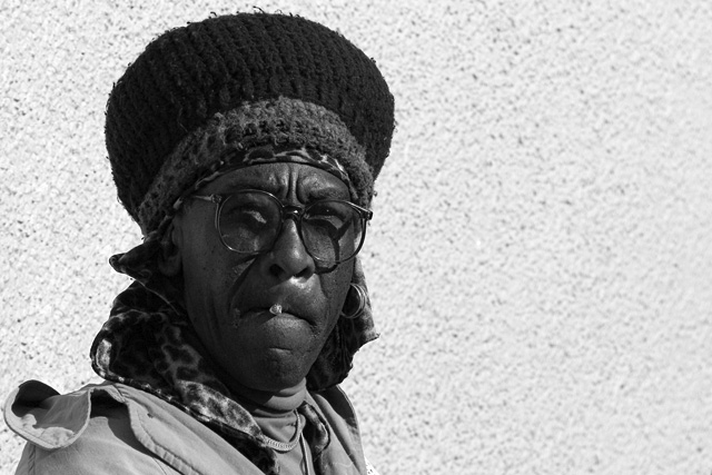
| Excellent use of contrast on this portrait. |
|
|
|
11/07/2006 03:24:44 AM |
| the background a bit too washed out, but a great shot, nevertheless!!! |
|
|
|
11/06/2006 09:48:20 PM |
| I wish the background wasn't so bright. This would be great with a little more tonal range in the face, IMO. |
|
|
|
11/06/2006 08:48:13 PM |
| I like how his fierce raggedness interacts with the specklespackle background. Not sure if I buy the composition, though. Would you have chopped it this way for a pure portrait challenge? Maybe... 8 |
|
|
|
11/05/2006 07:38:44 PM |
| Kind of loose the portrait in the contrast of the back ground. |
|
|
|
11/03/2006 10:26:55 PM |
| The portrait is interesting but the background (texture, blurriness)is distracting. Would be better cropped (but then probably wouldn't meet "landscape" requirement for the challenge). |
|
|
|
11/03/2006 08:01:46 PM |
| Why the black and white? He looks like a colorful character. |
|
|
|
11/01/2006 02:08:56 PM |
| Neat portrait, somewhat busy background. |
|
|
|
11/01/2006 11:58:53 AM |
|
|
|
11/01/2006 12:54:27 AM |
| I like the contrast, lighting and pose. However, I am not sure what the Landscape format gives you but dead space... |
|
Home -
Challenges -
Community -
League -
Photos -
Cameras -
Lenses -
Learn -
Help -
Terms of Use -
Privacy -
Top ^
DPChallenge, and website content and design, Copyright © 2001-2025 Challenging Technologies, LLC.
All digital photo copyrights belong to the photographers and may not be used without permission.
Current Server Time: 03/12/2025 06:40:11 PM EDT.