| Author | Thread |
|
|
01/11/2004 06:53:04 PM |
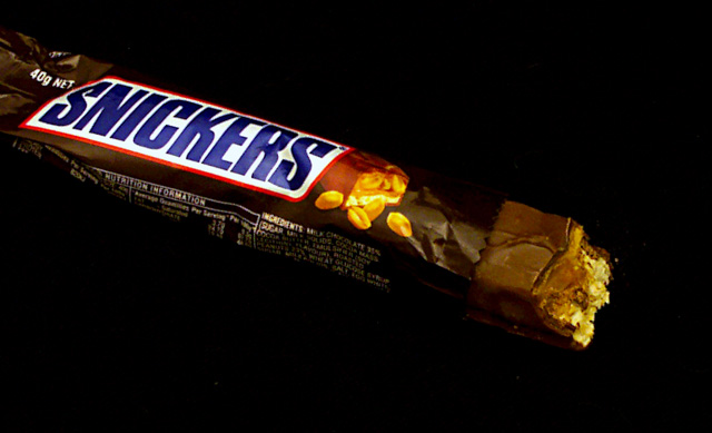
| I really like the slight crumpling of the wrapper. The black background shouldn't really work, but it does - enveloping the whole scene in cosy darkness (ideal for choc-munching). For a real ad shot, I think the client would have demanded everything a micro-dab sharper. |
|
 Photographer found comment helpful. Photographer found comment helpful. |
Comments Made During the Challenge  |
|
|
10/19/2003 02:20:59 AM |
| Yummy! Composition works well for me. Just a little sharpening would help this shot a lot. Nice work. |
|
| Photographer found comment helpful. |
|
|
10/15/2003 03:53:58 AM |
Beautifully done. Black background works!
Great title. |
|
| Photographer found comment helpful. |
|
|
10/13/2003 03:00:55 PM |
| lol not in my house!! Nice idea. |
|
| Photographer found comment helpful. |
|
|
10/13/2003 02:20:03 PM |
| I don't know whether it's the composition or the focus (probably both), but my eye is drawn to the "snickers" writing instead of the exposed, bitten surface. |
|
| Photographer found comment helpful. |
|
|
10/13/2003 01:42:41 PM |
Good, mouth watering now - sweet tooth you know!
Nicely lit and composed but a little too soft or OOF for my liking. |
|
| Photographer found comment helpful. |
|
|
10/13/2003 11:12:33 AM |
| You did a good job of creating a 'dark' background in this shot. I think a lighter background would create a better contrast with the dark colors of your subject and help bring out the detail more. It looks like it's floating in space with no visible surface. |
|
| Photographer found comment helpful. |
|
|
10/13/2003 04:17:43 AM |
Good points:funny idea
Bad Points: too much saturation and boring composition
Score:4 |
|
| Photographer found comment helpful. |
|
|
10/13/2003 01:33:14 AM |
| LOL, aint' that the truth! Good idea, would have used a different background, the black blends in too much for me. The cropping is also just off for me, if you could have included the entire wrapper, though it does help bring you in from one side to the other. Starting with a 7, will be back. |
|
| Photographer found comment helpful. |
Home -
Challenges -
Community -
League -
Photos -
Cameras -
Lenses -
Learn -
Help -
Terms of Use -
Privacy -
Top ^
DPChallenge, and website content and design, Copyright © 2001-2025 Challenging Technologies, LLC.
All digital photo copyrights belong to the photographers and may not be used without permission.
Current Server Time: 03/12/2025 02:41:25 PM EDT.