| Author | Thread |
Comments Made During the Challenge  |
|
|
11/06/2006 08:38:17 PM |
| her pose and expression fit the composition perfectly (I suppose most people would say that in reverse). 7 |
|
|
|
11/05/2006 04:03:00 PM |
This is an excellent shot! I would realy like to see some post processing on this! The whites are a bit to blue in hue for me and a simple vinette would really bring this together. Feel free to PM me if you'd like an example. It would take very little time if you're interested :0)
Awesome job! :0) |
|
|
|
11/05/2006 01:30:52 PM |
| It's an "ok" photograph. The composition is fine as far as her positioning, but the POV for the photographer (looking down) is taking away from the impact. Probably this choice was made because of distracting bg objects, but still, it would nice to see more of her face and especially her eyes. Considering this challenge is running under advanced rules you could have cloned out that chair leg in the top right, and removed the distracting black blob in the lower left. All JMO of course. Good luck in the challenge. |
|
|
|
11/03/2006 10:50:00 PM |
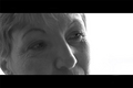
| This seems to me like a "found" moment, where you happened to see the girl in a good spot and took the shot. Unfortunately, it's also a "lost" opportunity. The row of chairs and costume could have worked great if you had only taken it one step further: ask the girl to slump over with her chin in her hands and look directly into the camera with a sad, lonely expression. That would immediately communicate your concept. Then crop it slightly to lose the dark shape at bottom left and crop or clone out the stray leg at top right. Warm morning or late afternoon lighting would have added about a point to the score. As it stands now, I'd guess the dull lighting and lack of expression in a challenge that specifically called for it is probably keeping your average somewhere around a 5. Next time, you'll know. ;-) |
|
|
|
11/03/2006 08:43:06 PM |
| ...and hopefully he won't turn into a frog! Tell your parents they did a good job with their photo of you. Maybe they could make is just slightly brighter next time. Just a thought. |
|
|
|
11/03/2006 05:47:12 PM |
| Colour is a bit washed out but I really like the story told in this single photo! |
|
|
|
11/03/2006 04:14:09 PM |
Meets Challenge:2
Technical:1
Ingenuity:1
Appeal:1
Opinion:1 |
|
|
|
11/02/2006 01:39:23 AM |
| May be improved by removal of blue color cast. Nice composition |
|
 Photographer found comment helpful. Photographer found comment helpful. |
|
|
11/01/2006 02:15:03 PM |
| Nice concept. If she was looking up a tad more I would appreciate this a few points more. I'd also have cloaned out the leg of the chair at the top. |
|
| Photographer found comment helpful. |
|
|
11/01/2006 12:41:27 PM |
| It is a good idea. Not sure if I like the compositional elements. A bit blue. It would be interesting to see the outtakes from this one. |
|
| Photographer found comment helpful. |
|
|
11/01/2006 01:52:48 AM |
| Pretty. Wish the angle was more on her level, she has a great face and emotion and I would like a better view. |
|
| Photographer found comment helpful. |
Home -
Challenges -
Community -
League -
Photos -
Cameras -
Lenses -
Learn -
Help -
Terms of Use -
Privacy -
Top ^
DPChallenge, and website content and design, Copyright © 2001-2025 Challenging Technologies, LLC.
All digital photo copyrights belong to the photographers and may not be used without permission.
Current Server Time: 03/14/2025 06:25:40 AM EDT.