| Author | Thread |
Comments Made During the Challenge  |
|
|
10/21/2003 01:13:57 PM |
| Nice concept - effective colour |
|
|
|
10/18/2003 11:37:44 PM |
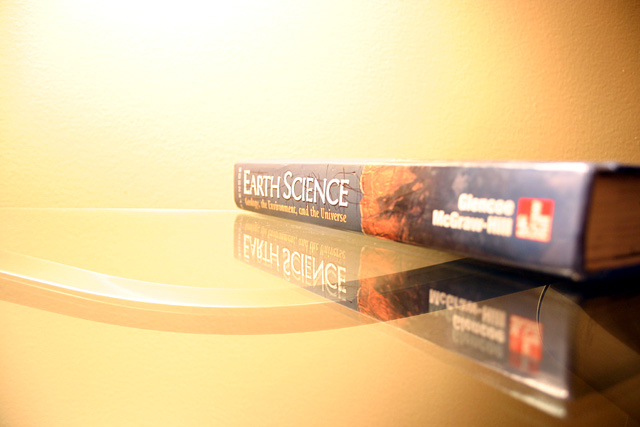
| I have that same textbook! I think you have portrayed that book as beautifully as it it could be, as earth science and all that has to do with it is really ugly. But really, I like the angle and the focus on 'Science'. Nice job :) |
|
 Photographer found comment helpful. Photographer found comment helpful. |
|
|
10/18/2003 11:14:40 AM |
|
|
|
10/17/2003 10:33:04 PM |
I like thre added interest of the reflection (or is it just part of the table beneath the glass?).
I think the lighting was a bit too bright. |
|
| Photographer found comment helpful. |
|
|
10/17/2003 09:14:00 AM |
| the background is not constant .. it would be better if it were all the same color, its too concentrated at the top and too dark in the right corners. The book is not in focus as well as it should be... and that curved bar in the reflection doesn't look good. |
|
| Photographer found comment helpful. |
|
|
10/15/2003 03:25:01 PM |
| nice shot. usually i find book shots rather boring but this one adds a little something to it. |
|
|
|
10/15/2003 12:19:23 AM |
| i coulda swore i had that book... |
|
Home -
Challenges -
Community -
League -
Photos -
Cameras -
Lenses -
Learn -
Help -
Terms of Use -
Privacy -
Top ^
DPChallenge, and website content and design, Copyright © 2001-2025 Challenging Technologies, LLC.
All digital photo copyrights belong to the photographers and may not be used without permission.
Current Server Time: 03/12/2025 02:28:27 PM EDT.