| Author | Thread |
|
|
11/15/2006 12:25:26 AM |
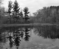
| So - why did this score .7 below your free study? I'm guessing because it's darker and because here you're actually contrasting the two pieces instead of making the reflection blend in. But I think it's a great variation on the theme. |
|
 Photographer found comment helpful. Photographer found comment helpful. |
Comments Made During the Challenge  |
|
|
11/13/2006 10:52:29 PM |
| this is a good idea i think but it's too dark and the blue background seems too strong. |
|
| Photographer found comment helpful. |
|
|
11/12/2006 07:28:29 PM |
| An original idea, and well executed. |
|
| Photographer found comment helpful. |
|
|
11/12/2006 06:52:52 AM |
| Good concept, still, I had to look closely to see the reflection. And I think the blue is disturbing. But I think that's personal taste |
|
| Photographer found comment helpful. |
|
|
11/09/2006 05:30:15 PM |
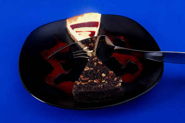
| Love the symetry in this picture. Makes me want cheese cake badly. 8 |
|
| Photographer found comment helpful. |
|
|
11/08/2006 09:23:37 PM |
| That is such an original idea! Great.. everything- It couldn't be improved one bit =) |
|
| Photographer found comment helpful. |
|
|
11/08/2006 03:24:26 PM |
|
| Photographer found comment helpful. |
Home -
Challenges -
Community -
League -
Photos -
Cameras -
Lenses -
Learn -
Help -
Terms of Use -
Privacy -
Top ^
DPChallenge, and website content and design, Copyright © 2001-2025 Challenging Technologies, LLC.
All digital photo copyrights belong to the photographers and may not be used without permission.
Current Server Time: 03/14/2025 06:16:47 AM EDT.