| Author | Thread |
|
|
10/30/2003 09:34:56 AM |
thanks all for kind comments as well as progressive critics on the shot, though i doubt anyone will be reading this but thanks anyway for all. I am jus an amatuer photographer and am happy that some of my shots could inspire. Thanks all. I'll improve upon more feedbacks. =)
Message edited by author 2003-10-30 09:36:45. |
|
Comments Made During the Challenge  |
|
|
10/28/2003 07:08:52 PM |
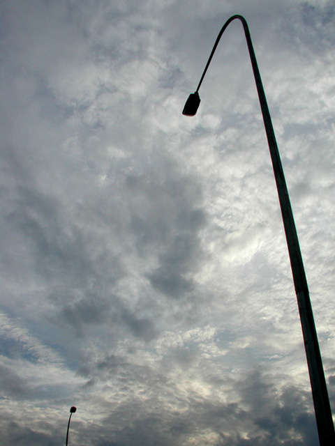
| Ah I like this image. Very simple, but fun. Nice contrast against that gorgeous sky. Perspective is good - gives an excellent feeling of height. I'm don't think it really fits the challenge specifically though - there are two poles after all. 5 |
|
 Photographer found comment helpful. Photographer found comment helpful. |
|
|
10/28/2003 05:20:12 AM |
| I like the angles in this |
|
|
|
10/26/2003 01:01:07 AM |
| A very dramatic sky (judicious application of curves could increase the contrast and make it even more dramatic), and the silhouetted streetlights add an element of interest. I like this photo. But I don't see much relevance to the challenge. |
|
| Photographer found comment helpful. |
|
|
10/24/2003 03:11:33 PM |
| great angle. great crop. I like the contrast between the straight light poles and the random clouds. 8 |
|
| Photographer found comment helpful. |
|
|
10/24/2003 02:02:24 AM |
| I love this picture I always find my self talking pictures of street lights all the time and i really have no idea why but any was great picture never forget to notice the sky! |
|
| Photographer found comment helpful. |
|
|
10/23/2003 08:11:45 PM |
| very good use of the negative space. Good tonal value with no blowouts in the sky/clouds and the tilting is perfect. Would like to see a little more of the futherest pole, but you were maybe trying to avoid all the activity below that point. Anyway, I like it. |
|
| Photographer found comment helpful. |
|
|
10/23/2003 05:56:14 PM |
Beatiful shot here. I love the almost B/W that you get with the clouds and the silhouette of the light poles! I do think the second pole in the background takes away from the strength of the single pole in the foreground though. Maybe try cropping just to the right of the second pole or (IMHO better) just above it.
TC |
|
| Photographer found comment helpful. |
|
|
10/22/2003 07:52:47 PM |
|
| Photographer found comment helpful. |
|
|
10/22/2003 03:57:29 PM |
| nice concept. title definitely adds to the impact. great perspective. |
|
| Photographer found comment helpful. |
|
|
10/22/2003 11:16:43 AM |
| Interesting graphic composition. I like the clouds. |
|
| Photographer found comment helpful. |
|
|
10/22/2003 07:49:36 AM |
| Excellent title, now this is an example of the title boosting the quality of the pic. Good one. |
|
| Photographer found comment helpful. |
|
|
10/22/2003 04:26:48 AM |
| Dont you think, they are sleeping now? It is dark only because a sky is background. I would like to see this picture with this Title made at night. |
|
| Photographer found comment helpful. |
Home -
Challenges -
Community -
League -
Photos -
Cameras -
Lenses -
Learn -
Help -
Terms of Use -
Privacy -
Top ^
DPChallenge, and website content and design, Copyright © 2001-2025 Challenging Technologies, LLC.
All digital photo copyrights belong to the photographers and may not be used without permission.
Current Server Time: 03/12/2025 06:38:29 PM EDT.