| Author | Thread |
|
|
12/07/2006 01:05:25 AM |
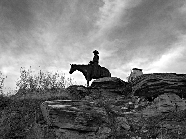
Just an idea, but the building could have been cloned out. It's not a major element in the image. Or, you could have gone in a bit further so that the right hand side of the image was right in front of the building (maybe adding some space to the left, the place into which the rider is looking). As it is, the rider is smack centre image, which makes for a rather static composition. Having him at a 1/3 down from top, 1/3 from right hand, looking into the space to the left would be better IMO.
Something else, the image is half&half, that is, half sky, half rock. It probably would be better to have about 1/3 sky, 2/3 rock. |
|
 Photographer found comment helpful. Photographer found comment helpful. |
|
|
11/20/2006 12:50:56 AM |
So to address some of the comments below:
The "building" in the picture was one of the lights around the statue. Unfortunately this was the best angle to get rid of them. The other angles I shot the statue from they were REALLY noticable. (I can understand why you would think its a building)
The glow around the rider? I don't see it myself but looking at some more I can see where one would think that. I am not sure how that came to be. I didn't do any dodging, burning etc. Which brings me to the next point... I should have done some dodge on the statue to bring out some more detail.
And yes, in retrospect I shouldn't have centered him. (Of course this was a test shot that turned out to be one of the best I took that afternoon).
Thank you all again for taking the time to comment. |
|
Comments Made During the Challenge  |
|
|
11/18/2006 12:30:54 AM |
| The glow around the rider ruins the image for me, shame because the texture of the rocks and sky is very good |
|
| Photographer found comment helpful. |
|
|
11/17/2006 07:53:24 AM |
| Textures in the sky and rock lend themselves to BW, but the horse should be less centrally placed. |
|
| Photographer found comment helpful. |
|
|
11/15/2006 09:10:42 PM |
| This is nice. Composition wise I'd like to see the rider not in the center. |
|
| Photographer found comment helpful. |
|
|
11/14/2006 01:48:24 PM |
| Lovely composition, like the lights on the rocks in front, has alot of depth and style. |
|
| Photographer found comment helpful. |
|
|
11/14/2006 10:18:39 AM |
You've got all the makings of the postcard competition with this one :-)
Nice use of silhouette. The building detracts a tad from the subject. |
|
| Photographer found comment helpful. |
|
|
11/13/2006 08:36:06 AM |
| try using photoshop to dodge the guy on the horse so it is lighter. other than that, great shot |
|
| Photographer found comment helpful. |
Home -
Challenges -
Community -
League -
Photos -
Cameras -
Lenses -
Learn -
Help -
Terms of Use -
Privacy -
Top ^
DPChallenge, and website content and design, Copyright © 2001-2025 Challenging Technologies, LLC.
All digital photo copyrights belong to the photographers and may not be used without permission.
Current Server Time: 03/12/2025 03:28:40 PM EDT.