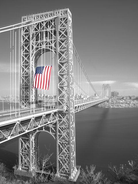
HDR of George Washington Bridge tribute to the Veterans on Veterans Day 2006. 7 infrared images merged and then a normal image if the flag layered onto the HDR merge.
This is only the second time this flag was on display at the bridge. This is the largest free flying flag in the United States.
The flag seems like a belch in the great, gaping mouth of this bridge. The selective desaturation contributes to this effect. The suspension cables create an exaggerated perspective, making it seem like the flag is issuing out from some deep central place within the bridge.
Displays like this remind me of Imperial Rome in its decline, when the excess of emperors seemed like a sign of insecurity, their insistence they were gods seemed like an overcompensation. I can almost already see this bridge as a large, impressive ruin for future tourists to marvel over.
I only click on the Helped box because you are so depressed if I didn't I would think you were going to kill yourself.
Hey buddy smile a little, a wonderful life is passing you by.
Oh and BTW "There was no selective or otherwise desaturating on this image."
All this tinkering with the camera and in PS, perhaps, gave you joy, but it was certainly not worth it for the image, as far as I can see. What does IR add to this shot? A single B&W shot with the red filter on would give a pretty similar result. Don't get me started on selective desaturation, I have yet to see an image where it worked well, and this is no exception. The perspective is quite usual, I've seen bridges in general, and this particular bridge, in particular, shot many times with this composition; however, the composition is alright.
I don't see anything about the veterans in the picture, so the title alone tries to give the image some context.
My reaction is the mixture of "boring" and "give me a break".
Your naivete is blinding which also explains the reason you can't see this as it is. 7 infrared and one normal shot for the flag shot at different aperture's and layered in photo shop as an HDR or High Dynamic Range shot. How do you think I got rid of all the cars on the bridge? I didn't photo shop them out. Study a little so you can enjoy the image for the work involved in making it. Anyone can take a snapshot.
There are areas in this image you couldn't get in one shot, and I am not talking about the flag. Look at the detail in the rafter's of the towers. This light is brought to you by HDR.
Tremendous shot. There is so much about this that I like, the single splash of colour, the receding bridge, the sharpness of the foreground against the softer distant background. Very impressive.
Having just read your write up it was a huge amount of work you did to produce this image, but I would say well worth the effort.
i like it, i like the flag popping out, i like the bridge disappearing into the background. I think if I were to see this in print tho, I'd like to see more black and white contrast, at least on the bridge.
edit to add: i agree with agenkin, I don't see the connection to veterans, more of a tribute to patriotism.
All this tinkering with the camera and in PS, perhaps, gave you joy, but it was certainly not worth it for the image, as far as I can see. What does IR add to this shot? A single B&W shot with the red filter on would give a pretty similar result. Don't get me started on selective desaturation, I have yet to see an image where it worked well, and this is no exception. The perspective is quite usual, I've seen bridges in general, and this particular bridge, in particular, shot many times with this composition; however, the composition is alright.
I don't see anything about the veterans in the picture, so the title alone tries to give the image some context.
My reaction is the mixture of "boring" and "give me a break".
The flag seems like a belch in the great, gaping mouth of this bridge. The selective desaturation contributes to this effect. The suspension cables create an exaggerated perspective, making it seem like the flag is issuing out from some deep central place within the bridge.
Displays like this remind me of Imperial Rome in its decline, when the excess of emperors seemed like a sign of insecurity, their insistence they were gods seemed like an overcompensation. I can almost already see this bridge as a large, impressive ruin for future tourists to marvel over.
That's a lot of work to produce your photo of this iconic monument. My reaction - the steel looks a little flat. HDR is a bit like stone-washing jeans, takes away something and give something. But sometimes what it gives (despite all the hard work of layer and what not) is not as rich an image as one might hope for. Had I not read your notes, I would have glanced over it. I reckon it has commercial potential for reason of the colourful flag - but around here I notice that selective colouring is not in vogue.