| Author | Thread |
Comments Made During the Challenge  |
|
|
11/21/2006 12:43:01 PM |
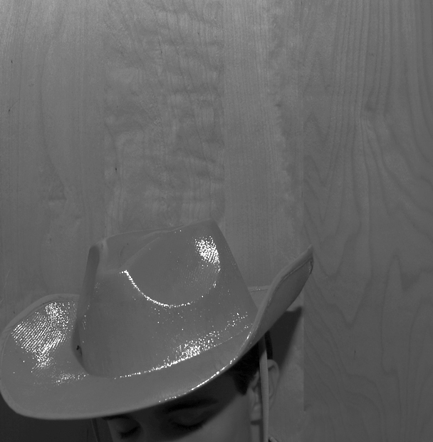
| The conversion on this photo is really flat, so it makes it hard to tell where the hat stops and the wall starts. |
|
 Photographer found comment helpful. Photographer found comment helpful. |
|
|
11/20/2006 07:51:21 PM |
| The desaturation does not work well for me here. |
|
| Photographer found comment helpful. |
|
|
11/19/2006 06:48:18 PM |
| Would have been better maybe if it was in color, and positioned differently? |
|
| Photographer found comment helpful. |
|
|
11/19/2006 05:41:35 PM |
| It's a shame it's all so grey. Gimme some contrast so i can see it! |
|
| Photographer found comment helpful. |
|
|
11/19/2006 01:26:15 PM |
| Too washed out- it is difficult to see the hat as the focus is on the background wall. I'm not sure I would have chose B&W for this photo. |
|
| Photographer found comment helpful. |
|
|
11/16/2006 10:27:25 AM |
| good just wished the hat would of stood out more. |
|
| Photographer found comment helpful. |
|
|
11/15/2006 10:52:01 PM |
| COULD HAVE USED A LITTLE MORE CONTRAST,AND A LITTLE LESS DOOR ABOVE THE COWBOY |
|
| Photographer found comment helpful. |
|
|
11/15/2006 10:39:40 AM |
| um... too much shine on hat, i would have used color, and shown more of his face and less of the wall behind him. |
|
| Photographer found comment helpful. |
Home -
Challenges -
Community -
League -
Photos -
Cameras -
Lenses -
Learn -
Help -
Terms of Use -
Privacy -
Top ^
DPChallenge, and website content and design, Copyright © 2001-2025 Challenging Technologies, LLC.
All digital photo copyrights belong to the photographers and may not be used without permission.
Current Server Time: 03/12/2025 07:41:11 AM EDT.