| Author | Thread |
|
|
10/27/2003 12:00:24 AM |
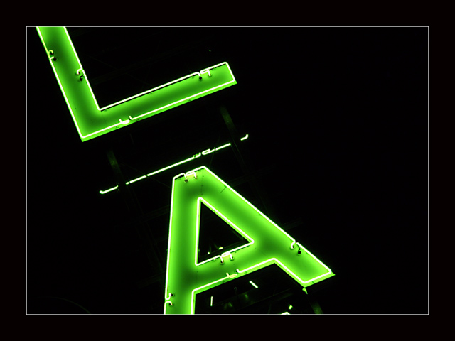
| I feel like too much of this sign was cut out |
|
 Photographer found comment helpful. Photographer found comment helpful. |
Comments Made During the Challenge  |
|
|
10/26/2003 08:34:41 PM |
|
| Photographer found comment helpful. |
|
|
10/26/2003 01:20:05 PM |
| I like it, but I think the empty space on the right dilutes the impact. I think it would work better in a portrait format. |
|
| Photographer found comment helpful. |
|
|
10/25/2003 01:55:25 AM |
| Nice graphic image. Good composition and excellent exposure. |
|
| Photographer found comment helpful. |
|
|
10/24/2003 04:33:06 PM |
| An interesting image. I like the vivid green against the black, and the letters chosen give an added interest because to me they do bring to mind the city L.A. Was this taken with a filter of some kind on - I'm seeing strange color variations on the letters, similar to how heat readings look (solarize?). Doesn't detract for me, was just curious. I do think the border is a little much, maybe half its size would be good. Great focus, great photo. 8 |
|
| Photographer found comment helpful. |
|
|
10/24/2003 02:56:24 PM |
| QUirky and dynamic image. Simple, but effective. Composition and cropping are wonderful. 9 |
|
| Photographer found comment helpful. |
|
|
10/23/2003 11:15:07 AM |
|
| Photographer found comment helpful. |
|
|
10/22/2003 12:47:35 AM |
| nice composition and cropping...wonderful lighting capture! |
|
| Photographer found comment helpful. |
|
|
10/21/2003 08:56:15 AM |
| Very good, love the green glow on the letters. Kind of reminds me of the colors in "Godzilla" The black background highlights your letters even more, yassir, way to go! |
|
|
|
10/21/2003 06:45:28 AM |
| The neon glow is great. The angle really makes this shot work and makes it more interesting. Great use of light. |
|
| Photographer found comment helpful. |
|
|
10/20/2003 05:48:15 PM |
| Good nightscape. Nice bright colors. Great angle. Good composition. 9. |
|
| Photographer found comment helpful. |
|
|
10/20/2003 11:39:46 AM |
| After a quick glimpse through the thumbnails, this is the shot that jumped out at me and caught my attention. Nice shot with a lot going for it. Love the color and sense of motion imparted by the tilted framing. Wish there was a bit more of the "back" of the L in the shot to balance the bottom more effectively (while stil leaving a bit to exit the frame like the bottom of the A). Congrats on a nice shot. |
|
| Photographer found comment helpful. |
|
|
10/20/2003 08:34:40 AM |
| This is my fav so far. The lighting is perfect and not over blown. The simple frame works great ! VERY nice ! 10 |
|
| Photographer found comment helpful. |
Home -
Challenges -
Community -
League -
Photos -
Cameras -
Lenses -
Learn -
Help -
Terms of Use -
Privacy -
Top ^
DPChallenge, and website content and design, Copyright © 2001-2025 Challenging Technologies, LLC.
All digital photo copyrights belong to the photographers and may not be used without permission.
Current Server Time: 12/14/2025 02:02:33 PM EST.