| Author | Thread |
Comments Made During the Challenge  |
|
|
11/26/2006 11:47:43 PM |
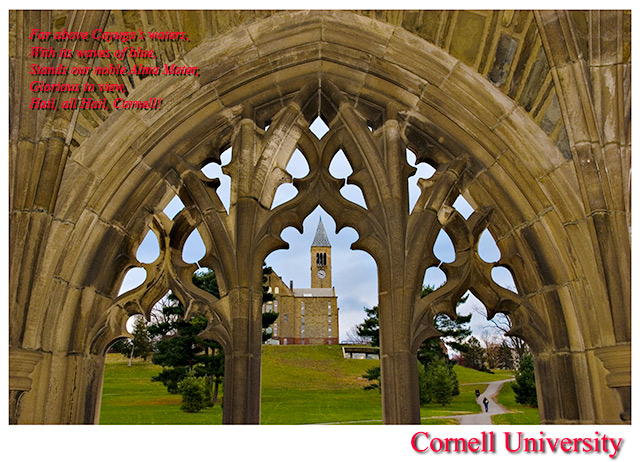
You left out
"Lift the chorus, speed it onward, loud her praises tell ..."
Cornell '88 :)
So - is this Zeke Smith?
It's a nice composition, but a little low contrast. More importantly, the lengthy text piece is very hard to read because of the red color, the drop shadow, the italics, and the placement. Straight white would work better. |
|
 Photographer found comment helpful. Photographer found comment helpful. |
|
|
11/26/2006 02:12:30 AM |
| I LOVE the shot, and find the inclusion of people adds interest, but I find the text overlay hard to read. |
|
| Photographer found comment helpful. |
|
|
11/26/2006 12:39:04 AM |
| The red stuff (the text) doesn't do this any favors, I do not even bother to read it... |
|
| Photographer found comment helpful. |
|
|
11/22/2006 07:31:36 PM |
| i think the red rhymes in the corner are a bit distracting, at least the colour. but i do love the white line with red title, and the photo itself is perfect for postcard. |
|
| Photographer found comment helpful. |
|
|
11/22/2006 03:57:11 PM |
| Beautiful shot - composition, color, focus. The red text in the upper left is too hard to read. That could be fixed by playing with the color and font style. (Italics are always harder to read.) |
|
| Photographer found comment helpful. |
|
|
11/21/2006 11:31:54 AM |
| I would have either not included the text in the top left corner or put it in a more readable color. As it is the text actual detracts from the image. |
|
| Photographer found comment helpful. |
|
|
11/21/2006 07:49:22 AM |
| Would have scored higher without the verse! Still, a well framed photo. |
|
| Photographer found comment helpful. |
|
|
11/20/2006 08:11:55 PM |
| Yay! GO BIG RED!!! Nostalgic for this class of '94 alum. Cool perspective. |
|
| Photographer found comment helpful. |
|
|
11/20/2006 04:34:22 PM |
| What a great history there. Amazing, old and interesting architecture. |
|
| Photographer found comment helpful. |
|
|
11/20/2006 09:08:23 AM |
| Great capture, font is difficult to read though. |
|
| Photographer found comment helpful. |
|
|
11/20/2006 05:14:28 AM |
|
| Photographer found comment helpful. |
|
|
11/20/2006 03:50:46 AM |
| beautiful composition. 7 for me. |
|
| Photographer found comment helpful. |
Home -
Challenges -
Community -
League -
Photos -
Cameras -
Lenses -
Learn -
Help -
Terms of Use -
Privacy -
Top ^
DPChallenge, and website content and design, Copyright © 2001-2025 Challenging Technologies, LLC.
All digital photo copyrights belong to the photographers and may not be used without permission.
Current Server Time: 03/16/2025 09:59:26 AM EDT.