| Author | Thread |
Comments Made During the Challenge  |
|
|
11/25/2006 03:56:29 PM |
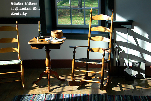
| Great lighting and interesting subject, I think cutting the left side of the chair out may hurt the score but still a very nice image. |
|
 Photographer found comment helpful. Photographer found comment helpful. |
|
|
11/24/2006 04:03:01 PM |
| I'm not all that fond of the text style/placement on the card, but I love the picture! |
|
| Photographer found comment helpful. |
|
|
11/23/2006 06:38:24 AM |
| Nice setup, but with all the bars and shadows, it ends up a bit cluttered for what should be a scene of simplicity. |
|
| Photographer found comment helpful. |
|
|
11/22/2006 06:34:33 PM |
| I like this. It's a nice departure from all the landscapes in this challenge. |
|
| Photographer found comment helpful. |
|
|
11/21/2006 04:00:42 PM |
| A good scene for a museum postcard, plenty of interest without too much detail. I'm not too sure about the chair that is not quite in the frame - makes the composition slightly unbalanced. I definitely don't care for the font - a postcard of a Shaker home would, to me, need a much simpler style, and whilst on the subject ot text, oops - bet you are kicking yourself now ;¬( |
|
| Photographer found comment helpful. |
|
|
11/21/2006 10:57:56 AM |
| I like the lighting and the way it plays against the starkness of the furniture. I don't like the font, however. It doesn't work with the image. |
|
| Photographer found comment helpful. |
|
|
11/21/2006 08:40:21 AM |
| This has a nice postcard feel to it. Clean, crisp, and interesting to look at. The strong lighting works overall, it does seem a little hot on the right rocking chair perhaps, but that's a minor issue in the big scheme of things here. :D I do get the impression you were timid on placing text on this nice photo? Personally, I would have maybe gone a little larger on the text (I like the font style BTW), and spread it out some, maybe even split the message into two parts; "Shaker Village" and then "Pleasant Hill, Kentucky". Something like that. All JMO of course. Overall, nicely done. Good luck in the challenge. |
|
| Photographer found comment helpful. |
|
|
11/20/2006 09:09:35 PM |
| I really like the shadows, also looked cool in BW |
|
| Photographer found comment helpful. |
|
|
11/20/2006 02:18:10 PM |
|
| Photographer found comment helpful. |
|
|
11/20/2006 11:43:10 AM |
| The chair of the left is disctracting. IMHO would have been better to have it complete or not at all. But really nice though. |
|
| Photographer found comment helpful. |
|
|
11/20/2006 09:39:34 AM |
|
| Photographer found comment helpful. |
|
|
11/20/2006 08:07:32 AM |
| The compostion with half a chair is not the best IMO. |
|
| Photographer found comment helpful. |
|
|
11/20/2006 12:32:51 AM |
| Very nice "homey" feeling. I especially like the different shadows from the window and chair. |
|
| Photographer found comment helpful. |
Home -
Challenges -
Community -
League -
Photos -
Cameras -
Lenses -
Learn -
Help -
Terms of Use -
Privacy -
Top ^
DPChallenge, and website content and design, Copyright © 2001-2025 Challenging Technologies, LLC.
All digital photo copyrights belong to the photographers and may not be used without permission.
Current Server Time: 03/23/2025 07:15:11 PM EDT.