| Author | Thread |
Comments Made During the Challenge  |
|
|
11/22/2006 03:07:52 PM |
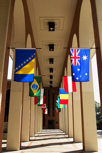
| 4 - Don't mind the concept but think a straightening and much tighter crop on each side to eliminate the distracting background elements, likely make this better in my opinion. The colors / flags combined with the architecture style and color, make this seem to border on 'clashing'/busy too, but again, eliminating the background/sides and trying to 'use' the unusual combinations, may have worked. Otherwise, maybe a toning/b&w - who knows. |
|
 Photographer found comment helpful. Photographer found comment helpful. |
|
|
11/22/2006 12:52:41 AM |
| 10 for the flag on the left! |
|
| Photographer found comment helpful. |
Home -
Challenges -
Community -
League -
Photos -
Cameras -
Lenses -
Learn -
Help -
Terms of Use -
Privacy -
Top ^
DPChallenge, and website content and design, Copyright © 2001-2025 Challenging Technologies, LLC.
All digital photo copyrights belong to the photographers and may not be used without permission.
Current Server Time: 03/13/2025 03:42:24 AM EDT.