| Author | Thread |
Comments Made During the Challenge  |
|
|
11/26/2006 08:54:52 PM |
|
 Photographer found comment helpful. Photographer found comment helpful. |
|
|
11/26/2006 02:30:13 AM |
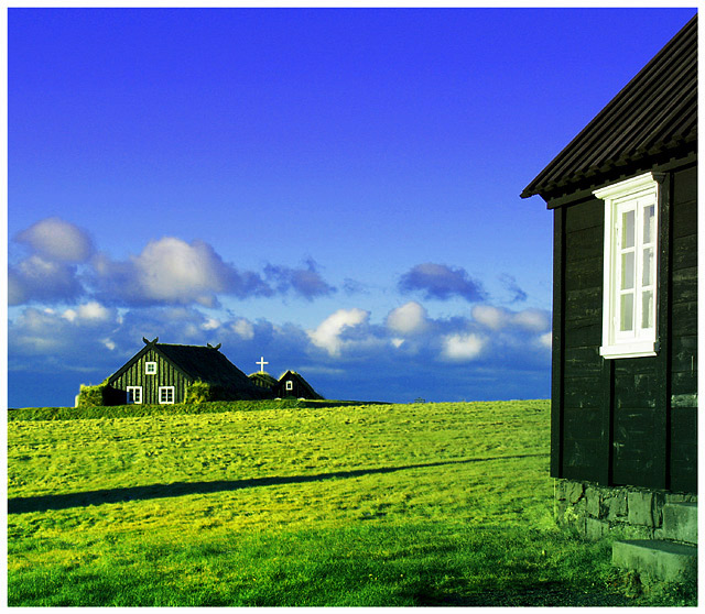
The degree of saturation has even given the windowframe shadows and the foundation a level of green that I don't imagine they should have.
The shot is beautiful and I'd love to see it in a less intense version. :) |
|
| Photographer found comment helpful. |
|
|
11/25/2006 06:00:03 PM |
| It looks a tad over saturated, but what an awesome place that must be. |
|
| Photographer found comment helpful. |
|
|
11/25/2006 12:47:02 AM |
| The green is way distracting. |
|
| Photographer found comment helpful. |
|
|
11/25/2006 12:02:12 AM |
| �rbær? Great colors and composition. I would have been sorely tempted to edit out that shadow coming in from the left, but I suppose that's against the rules. |
|
| Photographer found comment helpful. |
|
|
11/24/2006 03:22:12 PM |
| Aspect is a little off for a traditional postcard, but picture is awesome. |
|
| Photographer found comment helpful. |
|
|
11/24/2006 07:18:28 AM |
| I'm guessing it's Iceland. |
|
| Photographer found comment helpful. |
|
|
11/23/2006 05:57:01 PM |
| Lovely shot, not a good format for a postcard. |
|
| Photographer found comment helpful. |
|
|
11/23/2006 06:02:01 AM |
| The green is too green IMHO. But overall a nice scandinavian countryshot, nicely composed, with good contrast. |
|
| Photographer found comment helpful. |
|
|
11/22/2006 08:10:05 PM |
| The greens seem to be a bit over saturated in this. |
|
| Photographer found comment helpful. |
|
|
11/22/2006 07:24:32 AM |
|
| Photographer found comment helpful. |
|
|
11/21/2006 09:51:48 PM |
| I love the composition, but the colors are a little too saturated. Great Picture! |
|
| Photographer found comment helpful. |
|
|
11/21/2006 04:40:03 PM |
| The colors really jump out here, I can see this being a postcard. Interesting composition and an overall great shot. |
|
| Photographer found comment helpful. |
|
|
11/21/2006 07:55:23 AM |
| Much too over-saturated for my tastes - the stone at the base of the near building has taken on a strong green tinge. A shame, because you have a good composition here. |
|
| Photographer found comment helpful. |
|
|
11/20/2006 05:17:55 PM |
| I love the perspective but the colors look too tweaked to me. Green is really bright. |
|
| Photographer found comment helpful. |
|
|
11/20/2006 05:04:16 PM |
|
| Photographer found comment helpful. |
|
|
11/20/2006 04:50:37 PM |
| pumped up the green a little too much. the rocks and steps on this foreground building look way off color-wise |
|
| Photographer found comment helpful. |
|
|
11/20/2006 04:42:58 PM |
|
| Photographer found comment helpful. |
|
|
11/20/2006 02:26:06 PM |
| i love the colors but feel like it needs some words to explain |
|
| Photographer found comment helpful. |
|
|
11/20/2006 10:51:41 AM |
| Far too oversaturated in my opinion. Score: 4. |
|
| Photographer found comment helpful. |
|
|
11/20/2006 08:06:51 AM |
Ouch... my eyes hurt :)
I think you've overdone it on the colours here. |
|
| Photographer found comment helpful. |
|
|
11/20/2006 02:23:24 AM |
|
| Photographer found comment helpful. |
|
|
11/20/2006 01:39:21 AM |
| Text could have added to this image. Its a great picture but its size (relatively square) work against it as a postcard. This also looks oversaturated. |
|
| Photographer found comment helpful. |
Home -
Challenges -
Community -
League -
Photos -
Cameras -
Lenses -
Learn -
Help -
Terms of Use -
Privacy -
Top ^
DPChallenge, and website content and design, Copyright © 2001-2025 Challenging Technologies, LLC.
All digital photo copyrights belong to the photographers and may not be used without permission.
Current Server Time: 03/12/2025 02:47:56 PM EDT.