| Author | Thread |
|
|
11/28/2006 10:50:48 PM |
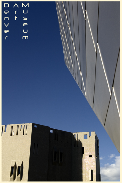
| I think this shot looks "stealth"...now you figure out what I mean by that cause I'm not sure even I know. However, what I mean is that the shot has a FEEL to it..not really industrial, but cool like metal and blue ice and reminds me of aero materials, etc. Nice idea and very non-typical of the large number of landscapes/cityscapes submitted in this challenge. sentence comes to mind...your just that good! I LIKE the picture, a lot! |
|
 Photographer found comment helpful. Photographer found comment helpful. |
|
|
11/27/2006 07:59:09 PM |
| Ha! I remember chuckling at your title when I voted on this one. Nice blue gradient and a cool composition. |
|
| Photographer found comment helpful. |
Comments Made During the Challenge  |
|
|
11/26/2006 11:22:03 PM |
|
| Photographer found comment helpful. |
|
|
11/26/2006 10:22:00 PM |
| nice composition, great crop |
|
| Photographer found comment helpful. |
|
|
11/26/2006 03:51:04 AM |
| Need to lighten the shadow on the building. |
|
| Photographer found comment helpful. |
|
|
11/25/2006 12:55:15 AM |
Meets Challenge - 1 of 2
Lighting/Processing - 2 of 2
Composition - 1 of 2
Overall Impression - 0
"WOW" factor -0 |
|
|
|
11/22/2006 02:39:26 PM |
|
| Photographer found comment helpful. |
|
|
11/21/2006 08:30:44 PM |
| excellent composition - very edgy and cool postcard for a cool place |
|
| Photographer found comment helpful. |
|
|
11/21/2006 09:33:16 AM |
| I like the attempt to do something different for the art museum. It's fitting. |
|
| Photographer found comment helpful. |
|
|
11/21/2006 08:40:51 AM |
|
| Photographer found comment helpful. |
|
|
11/21/2006 12:24:54 AM |
| Just the right point of view and font for an art museum. Nice work. |
|
| Photographer found comment helpful. |
|
|
11/20/2006 10:07:17 PM |
| The text is arty, but a little hard to figure out. Nevertheless, the shot is terrific and definitely captures the concept of art! |
|
| Photographer found comment helpful. |
|
|
11/20/2006 08:53:50 AM |
| the dark shadow is distracting, had preferred a white border |
|
| Photographer found comment helpful. |
|
|
11/20/2006 04:35:16 AM |
|
| Photographer found comment helpful. |
|
|
11/20/2006 01:13:37 AM |
| Unique and hip. I like it. |
|
| Photographer found comment helpful. |
|
|
11/20/2006 12:25:38 AM |
| The title and the way you have it is very hard to read. Would have not used that particular font either. Nice sky against the greys and light browns. |
|
| Photographer found comment helpful. |
Home -
Challenges -
Community -
League -
Photos -
Cameras -
Lenses -
Learn -
Help -
Terms of Use -
Privacy -
Top ^
DPChallenge, and website content and design, Copyright © 2001-2025 Challenging Technologies, LLC.
All digital photo copyrights belong to the photographers and may not be used without permission.
Current Server Time: 04/08/2025 08:16:03 PM EDT.