| Author | Thread |
|
|
11/29/2006 10:54:12 AM |
Hello from the Critique Club,
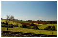
You found a very lovely scene and did a very nice job with the composition. The size relationship between the plant and mountain give the image a lot of depth. Where I think this image falls a little short is in the color. The harsh sun gives the image a washed-out look. You might want to try bumping the gamma in levels and then decreasing the brightness. This will strengthen the colors and contrast in the mid-range features.
Feel free to PM me if you have any questions regarding this critique.
Tim
|
|
 Photographer found comment helpful. Photographer found comment helpful. |
Comments Made During the Challenge  |
|
|
11/26/2006 06:05:50 PM |
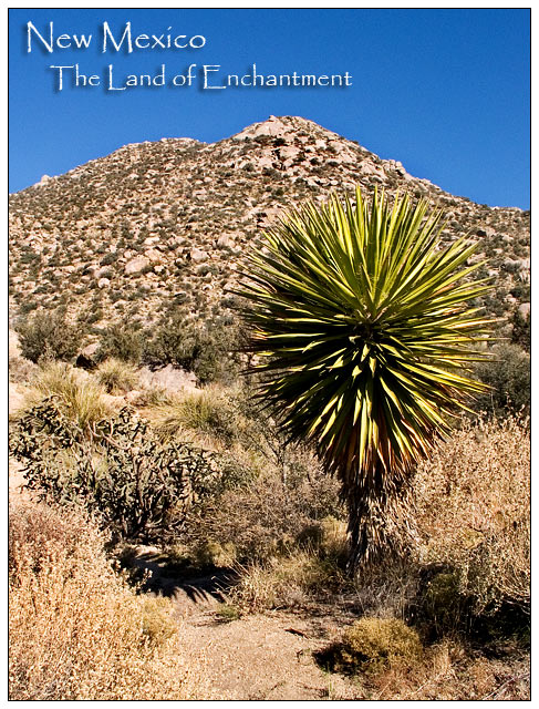
| Good, maybe a bit more contrast for postcard impact. |
|
|
|
11/23/2006 02:19:02 AM |
| Great! Looks just like a postcard. |
|
| Photographer found comment helpful. |
|
|
11/21/2006 09:43:25 PM |
| i would have recommended boosting the saturation some - everything looks tan - (by the way - i know it is), but bringing our more green where there is would have helped it pop out more |
|
| Photographer found comment helpful. |
|
|
11/20/2006 05:11:48 AM |
|
| Photographer found comment helpful. |
|
|
11/20/2006 12:32:11 AM |
| the color of the sky is nice, but otherwise I don't see anything that would make me want to come to NM |
|
| Photographer found comment helpful. |
Home -
Challenges -
Community -
League -
Photos -
Cameras -
Lenses -
Learn -
Help -
Terms of Use -
Privacy -
Top ^
DPChallenge, and website content and design, Copyright © 2001-2025 Challenging Technologies, LLC.
All digital photo copyrights belong to the photographers and may not be used without permission.
Current Server Time: 03/15/2025 06:37:31 PM EDT.