| Author | Thread |
|
|
12/09/2006 08:07:22 AM |
| I love fog in photos snd the special mood it creates! too bad I didn't vote in that challenge. I really like the dreamy and "human" mood the picture has - in opposite to often flat and smooth beauty of many postcards. I'd love to get a one like this some day:) |
|
 Photographer found comment helpful. Photographer found comment helpful. |
|
|
11/27/2006 10:34:08 AM |
| Nice going. I'm not sure it would attract much attention on the postcard rack, but it's a very nice image. BTW what's a high pass layer? |
|
| Photographer found comment helpful. |
|
|
11/27/2006 10:32:54 AM |
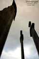
I like the idea a lot (which is why I have my own fogbound boat shot in my portfolio). The text is hard to read, as others have noted, but to me what made me vote 5 vs. higher is the orientation.
Fog seems to me to be about isolation. No one expects there to be anything else far above the water, so what really drives home that point is to show nothing else ON the water. If you have the room, try a landscape crop to see how it looks. |
|
| Photographer found comment helpful. |
|
|
11/27/2006 10:03:48 AM |
| Excellent job of making the text part of the composition. And the title expands further. You got success. |
|
| Photographer found comment helpful. |
Comments Made During the Challenge  |
|
|
11/26/2006 04:44:06 PM |
| Excellent shot, one of the really good ones in the challeng. Voted (9) days ago, just back to leave a comment and wish you good luck. I hope it does well. |
|
| Photographer found comment helpful. |
|
|
11/25/2006 06:29:19 AM |
| Hahah, very cute title! I really have a weakness for fog shots and this one is no exception. The font on the image is not my favorite though. I like the lonely boat with only the small buoy for company, and also all that negative space. Giving this one a 7. |
|
| Photographer found comment helpful. |
|
|
11/24/2006 03:46:37 PM |
| Wonderful idea and execution. |
|
| Photographer found comment helpful. |
|
|
11/22/2006 04:35:48 PM |
| I can hardly read the text.. average photo, not really inspiring, and it could be anywhere really. |
|
| Photographer found comment helpful. |
|
|
11/22/2006 07:19:29 AM |
| Very interesting shot! I like your text. :) |
|
| Photographer found comment helpful. |
|
|
11/21/2006 01:46:47 PM |
| Text is a little hard to read. Well concieved and executed. |
|
| Photographer found comment helpful. |
|
|
11/20/2006 10:18:05 PM |
|
| Photographer found comment helpful. |
|
|
11/20/2006 12:47:45 PM |
| I think this would have worked just as well with clearer text - although I do see what you were aiming at. Got to give you points for the giggle though! |
|
| Photographer found comment helpful. |
|
|
11/20/2006 10:32:30 AM |
| i wish the font was easier to see and read, great photo |
|
| Photographer found comment helpful. |
|
|
11/20/2006 09:20:36 AM |
| the text doesn't really work very well here ... hard to read ... I think that this needs a border also ... |
|
| Photographer found comment helpful. |
|
|
11/20/2006 01:29:07 AM |
| I understand the concept, but it's almost impossible to read the text. |
|
| Photographer found comment helpful. |
|
|
11/20/2006 12:34:04 AM |
| Would have made the title a little less opaque. Still love the shot! 8 |
|
| Photographer found comment helpful. |
Home -
Challenges -
Community -
League -
Photos -
Cameras -
Lenses -
Learn -
Help -
Terms of Use -
Privacy -
Top ^
DPChallenge, and website content and design, Copyright © 2001-2025 Challenging Technologies, LLC.
All digital photo copyrights belong to the photographers and may not be used without permission.
Current Server Time: 03/12/2025 08:29:11 PM EDT.