| Author | Thread |
Comments Made During the Challenge  |
|
|
10/27/2003 07:23:17 PM |
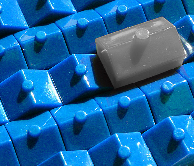
| Fun image! I like the vivid color, and the contrast in color and in shape. I like the idea behind the image too but I think leaving the bright red of hotels would make a better contrast than the grey. Focus is good, so is lighting. Nice work. 8 |
|
 Photographer found comment helpful. Photographer found comment helpful. |
|
|
10/24/2003 12:10:57 AM |
| Blue on the houses looks oversaturated...isn't a very interesting shot..sorry. |
|
| Photographer found comment helpful. |
|
|
10/23/2003 09:19:27 PM |
| never seen a grey monopoly piece, interesting |
|
| Photographer found comment helpful. |
|
|
10/23/2003 09:06:37 AM |
| Good use of color to accentuate mood. 9 |
|
| Photographer found comment helpful. |
|
|
10/22/2003 01:20:44 PM |
| This looks like a toy version of one of the "urban landscapes" images. The highlights are a little hot, but other than that, nice idea and good composition. |
|
| Photographer found comment helpful. |
|
|
10/22/2003 04:45:21 AM |
| Nice idea, but the reflections and glare spoil it a little |
|
| Photographer found comment helpful. |
Home -
Challenges -
Community -
League -
Photos -
Cameras -
Lenses -
Learn -
Help -
Terms of Use -
Privacy -
Top ^
DPChallenge, and website content and design, Copyright © 2001-2025 Challenging Technologies, LLC.
All digital photo copyrights belong to the photographers and may not be used without permission.
Current Server Time: 04/26/2025 05:27:04 PM EDT.