| Author | Thread |
|
|
12/06/2006 08:54:35 PM |
| I would like to see you contrast this up, good idea. |
|
 Photographer found comment helpful. Photographer found comment helpful. |
|
|
12/04/2006 10:32:27 AM |
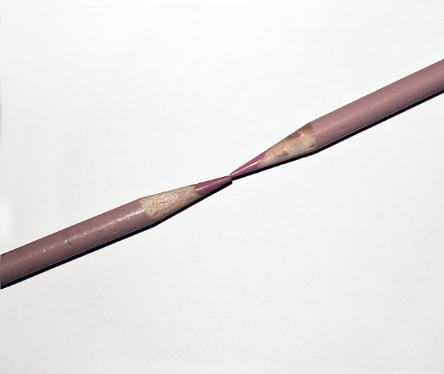
| How to avoid the harsh light syndrome? I'm still working on that myself - sometimes I like my light harsh. For this shot, though, I think it would have been more effective if the light were indeed more diffuse and softer, and if you'd come in a lot closer to the tips of the pencils - the empty space here just feels too empty to me. For softer light, try using a sheer fabric of some kind, or pointing the light at a white posterboard and reflecting that back onto your subject. It will require a slower shutter speed, requiring a tripod, but can be worth the effort. |
|
| Photographer found comment helpful. |
Comments Made During the Challenge  |
|
|
11/30/2006 10:51:12 AM |
| The light looks very hard in this photo despite soft color. Focal point where pencils meet might be stronger if less centered. |
|
| Photographer found comment helpful. |
|
|
11/28/2006 01:06:45 PM |
| Looks more like beige.....and that's unfortunate, I think. |
|
| Photographer found comment helpful. |
|
|
11/27/2006 05:55:36 PM |
| Alright! I get the point! You, however, get the points! :) 8 of them...to be exact! :) |
|
| Photographer found comment helpful. |
|
|
11/27/2006 11:50:20 AM |
| Harsh shadows ruing this "study" in light, form and composition. Not much to hold my interest here. |
|
| Photographer found comment helpful. |
Home -
Challenges -
Community -
League -
Photos -
Cameras -
Lenses -
Learn -
Help -
Terms of Use -
Privacy -
Top ^
DPChallenge, and website content and design, Copyright © 2001-2025 Challenging Technologies, LLC.
All digital photo copyrights belong to the photographers and may not be used without permission.
Current Server Time: 03/13/2025 04:59:36 AM EDT.