| Author | Thread |
|
|
10/29/2003 02:36:36 PM |
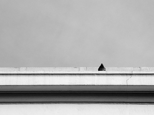
I feel much like Fayech and LucidLotus, both critically and as a voter. Neither do I have any trouble discerning the pidgeon.
I speculate, that on miscalibrated monitors, beak and wings may be lost in a mere silhouette. It is a very quiet and simple capture too, with good emphasis on topicality here, perhaps appealing predominantly to those without prejudiced visions and others who appreciate the sentiments. |
|
 Photographer found comment helpful. Photographer found comment helpful. |
Comments Made During the Challenge  |
|
|
10/28/2003 11:26:10 PM |
| Hard to tell what the subject is, but nice setting anyhow. |
|
| Photographer found comment helpful. |
|
|
10/28/2003 09:05:28 PM |
| The like the simple composition of this shot and the nextrue of the wall/ledge behind the bird. |
|
| Photographer found comment helpful. |
|
|
10/28/2003 06:37:52 PM |
| Great use of space, really supports the alone/solitude feel of the image. Good contrast with the b&w, definitely adds interest. The focus looks pretty good and the light usage is nice. Well done. 7 |
|
| Photographer found comment helpful. |
|
|
10/28/2003 08:37:44 AM |
| Unfortunately, it's too hard to make out the pidgeon. |
|
|
|
10/27/2003 08:32:35 PM |
| Nicely composed image, but I wish the bird were larger in the frame. |
|
| Photographer found comment helpful. |
|
|
10/27/2003 10:37:16 AM |
| The wide scope of this shot accentuates the alone-ness of the pigeon, but it would be a more compelling subject if it were closer. |
|
| Photographer found comment helpful. |
|
|
10/24/2003 07:49:19 PM |
| love this! great horizontal lines. adds a quiet calm. the b/w gradients are great. very simple composition, well done. |
|
| Photographer found comment helpful. |
|
|
10/23/2003 08:55:56 PM |
| meets the challenge but its hard to tell what it is. makes you wonder where its taken and what the photographer wants to express |
|
| Photographer found comment helpful. |
|
|
10/22/2003 04:42:26 PM |
| B&W is a good choice here. I like the lines and textures and how they help the bird stick out. 8 |
|
| Photographer found comment helpful. |
|
|
10/22/2003 02:02:37 PM |
| Nice interpretation and good use of negative space. Personally, it may have improved if you cropped the white part off of the bottom of the bridge. The darker section would have made for a better bottom border. |
|
| Photographer found comment helpful. |
|
|
10/22/2003 11:19:30 AM |
|
|
|
10/22/2003 09:21:14 AM |
| I like your use of negative space and black & white. I think the crack in the cement is a nice touch and the fact that your subject is so small really emphasizes the idea of being alone. The only think that detracts from the shot to me is I can't really tell what the subject is. I think it's a bird (a pigeon?), andl this is going to sound like I'm a real goofball, but for the longest time while typing this, I thought it was a girl facing away from the camera and that dark shadowed area was her long black hair. LOL! Can I blame that on my monitor? Anyway, it's a great shot overall. I like it. |
|
| Photographer found comment helpful. |
Home -
Challenges -
Community -
League -
Photos -
Cameras -
Lenses -
Learn -
Help -
Terms of Use -
Privacy -
Top ^
DPChallenge, and website content and design, Copyright © 2001-2025 Challenging Technologies, LLC.
All digital photo copyrights belong to the photographers and may not be used without permission.
Current Server Time: 03/12/2025 07:54:56 PM EDT.