| Author | Thread |
|
|
12/13/2006 02:57:16 AM |
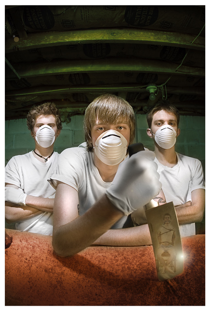
| You did a hell of a job on this Evan. It would be right at home in the new "experts" challenges :-) I am assuming the hot spot of light on the blade was added, and that the "reflection" is a separate image pasted /blended in? I don't see how the "reflection" can be real, considering the angle of the knife. I'd love to know how you did it. This is a wonderful piece of work, the processing and the lighting are just excellent. |
|
Comments Made During the Challenge  |
|
|
12/11/2006 03:21:15 AM |
| Very nice attention to detail! My favourite pic in this challenege... |
|
|
|
12/11/2006 12:33:19 AM |
| Awesome idea! I'll be anxious to see how you accomplished the great reflection in the blade. :D |
|
|
|
12/10/2006 11:33:49 PM |
| the blue ribbon winner in my opinion...excellent image...great title...love the poses and the setting...has to be a 10 from me |
|
|
|
12/10/2006 11:20:36 AM |
| Very well executed...pun intended. |
|
|
|
12/10/2006 10:53:25 AM |
| what is that knife cutting into? at first i thought it was a pig carcass, but i don't think it is. that little hole on the left makes it look like wood. my eyebrows are knit on this one. the boys are very nicely captured, i like the lighting on the top half of the shot, but i don't know what the picture on the knife represents either. can't wait to read the notes on this one. very interesting photo. good luck in the challenge. |
|
|
|
12/10/2006 01:53:42 AM |
|
|
|
12/09/2006 04:25:35 PM |
Looks like Advanced editing here, but I'll give you the benefit of the doubt. 9
Best in show so far |
|
|
|
12/09/2006 11:36:36 AM |
| *ggg* cool. I think this one is my favourite! 10 for it. |
|
|
|
12/09/2006 06:59:34 AM |
| Great idea, love the atmoshpere. |
|
|
|
12/08/2006 04:10:20 PM |
|
|
|
12/08/2006 03:23:24 PM |
| Hmm i dunno, does this fall under the "basic Editing" rules? looks quite a bit edited to me, though i could be wrong, the guy on the right looks identicle to my friend cody so because of that ill give it a 5 lol |
|
|
|
12/08/2006 02:46:31 PM |
| in my top picks.. its a beautifully done shot! Love the green walls! 8 |
|
|
|
12/08/2006 01:57:10 PM |
| The topic is death not TWISTED.... |
|
|
|
12/08/2006 01:11:06 PM |
| My favorite in this challenge! |
|
|
|
12/07/2006 06:33:25 PM |
well. this is definatly more creative than some of the others iv seen.
is this basic ed though?
eh, i dont care.
good job |
|
|
|
12/07/2006 05:15:41 PM |
Very creative. I like it a lot. Could be a winner in a pretty uninspiring challenge. 9
BTW: I am going to ask for validation on this shot. Look for it. That highlight just looks a bit too perfect on the knife. Look at it this way, you are going to get validated anyway because if it passes muster this will be a ribbon. |
|
|
|
12/07/2006 04:36:23 PM |
this is just plain good! Love the reflection in the knife, and the cold expression on their faces. brilliant!
added to faves :D |
|
|
|
12/07/2006 03:57:00 PM |
| Sweet!! Excellent shot - nicely done - especially like the reflection in the cleaver!! |
|
|
|
12/07/2006 02:56:25 PM |
| This is so Kick Ass!! This is like the 5th time I've looked at this and it's the first time I noticed the refelection in the knife. Calls for a bump up. :) can't wait to see how you did it. |
|
|
|
12/07/2006 02:02:39 PM |
| Very creepy, but well executed. Great job of being clever and creative with the subject. |
|
|
|
12/07/2006 10:33:33 AM |
| Nice lighting and colours. |
|
|
|
12/07/2006 09:22:35 AM |
| This is creepy and uber cool. Looks like a CD cover!! |
|
|
|
12/07/2006 05:03:13 AM |
| This belongs in a challenge called "Creep Me Out And Give Me Nightmares". That is just downright scary. Great development of the idea and flawless technical execution. This could easily be a poster for a teen slasher film. |
|
|
|
12/06/2006 08:45:12 PM |
| nice job! very funny and creative with a nice 'execution' : ) |
|
|
|
12/06/2006 08:33:49 PM |
| This would make a great album cover. |
|
|
|
12/06/2006 08:15:27 PM |
| This is a truly scary photo. The refection is very well done, however. It works. |
|
|
|
12/06/2006 07:29:57 PM |
| That there is one heck of a photo... like a movie poster... nothing but cool... |
|
|
|
12/06/2006 05:57:00 PM |
|
|
|
12/06/2006 10:54:55 AM |
| I can't tell you why, but I love this photo, especially the shine on the cleaver. |
|
|
|
12/06/2006 10:52:55 AM |
| Not wanting to be picky, but the hand COULD be sharper. Otherwise perfect. Good use of wide angle, blink on knife's edge is a nice touch. |
|
|
|
12/06/2006 10:12:15 AM |
| Let me be among the first to congratulate you on your ribbon -- I can't imagine this wouldn't make the top 3! Nicely executed -- gotta love the reflection in the knife! |
|
|
|
12/06/2006 09:11:14 AM |
| hahahaa... nice one. but too much work in photoshop. I'll give it good points, but in real life, i'd reject it as a foto. |
|
|
|
12/06/2006 12:57:18 AM |
|
|
|
12/06/2006 12:56:27 AM |
| awesome!! i hope this does well!! |
|
Home -
Challenges -
Community -
League -
Photos -
Cameras -
Lenses -
Learn -
Help -
Terms of Use -
Privacy -
Top ^
DPChallenge, and website content and design, Copyright © 2001-2025 Challenging Technologies, LLC.
All digital photo copyrights belong to the photographers and may not be used without permission.
Current Server Time: 04/01/2025 07:56:14 PM EDT.