| Author | Thread |
Comments Made During the Challenge  |
|
|
12/19/2006 05:59:13 PM |
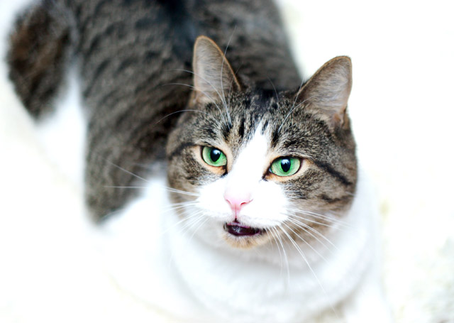
| The whites are too bright. It is overexposed. Picture would be better if it was a close up of the face. The body looks blurred. |
|
|
|
12/17/2006 12:16:33 AM |
| 6 - Think I understand the high key concept but not sure it is working with this composition. Like the angle, but because I can only make out some 'areas' around the neck/chest/etc, and they don't 'flow', makes it slightly distracting. Perhaps more included at the top and more frame vertically make this better, not sure. Nice pose and nice color capture (other than the aforementioned whites), just like to have seen a little more clarity in the eyes and nose. |
|
 Photographer found comment helpful. Photographer found comment helpful. |
|
|
12/16/2006 08:56:35 AM |
| Beautiful eye color and nice focus on the eyes. However, the whites are too bright for me. |
|
| Photographer found comment helpful. |
|
|
12/13/2006 06:26:37 PM |
| With the blown highlights we can't see a lot of the cat. |
|
|
|
12/13/2006 03:46:43 PM |
| The bottom half is a little too blown out. |
|
| Photographer found comment helpful. |
|
|
12/13/2006 10:48:02 AM |
| the cat blends too much with the background |
|
| Photographer found comment helpful. |
|
|
12/13/2006 08:10:48 AM |
| nice capture on the eyes - but too much of the face is blown out - bringing back the contrast a little may have helped |
|
| Photographer found comment helpful. |
Home -
Challenges -
Community -
League -
Photos -
Cameras -
Lenses -
Learn -
Help -
Terms of Use -
Privacy -
Top ^
DPChallenge, and website content and design, Copyright © 2001-2025 Challenging Technologies, LLC.
All digital photo copyrights belong to the photographers and may not be used without permission.
Current Server Time: 03/12/2025 10:06:03 AM EDT.