| Author | Thread |
|
|
01/08/2007 08:45:28 AM |
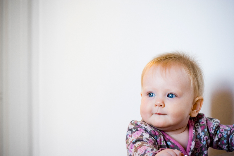
| I like this shot, I think it´s well composed. I would however had just a tiny bit less space on the left and the top to include the bottom of the hand and the left arm, kindof bugs me that you cut them out of the frame but definately I think it´s the space around the kid that makes this image work. Nice lighting and DOF. |
|
 Photographer found comment helpful. Photographer found comment helpful. |
|
|
12/29/2006 08:05:10 PM |
| Here the color looks a bit over-saturated to my eyes. I like portraits to be a bit un-saturated, as they appear softer on the eyes. |
|
| Photographer found comment helpful. |
|
|
12/17/2006 09:51:53 PM |
| great shot, something caught her attention? beautiful eyes |
|
| Photographer found comment helpful. |
Home -
Challenges -
Community -
League -
Photos -
Cameras -
Lenses -
Learn -
Help -
Terms of Use -
Privacy -
Top ^
DPChallenge, and website content and design, Copyright © 2001-2025 Challenging Technologies, LLC.
All digital photo copyrights belong to the photographers and may not be used without permission.
Current Server Time: 04/21/2025 11:16:07 PM EDT.