| Author | Thread |
Comments Made During the Challenge  |
|
|
12/26/2006 10:56:24 PM |
| I like the perspective and composition. 8 |
|
 Photographer found comment helpful. Photographer found comment helpful. |
|
|
12/26/2006 05:08:05 PM |
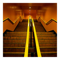
| fab composition. Would have made it a bit browner all over though! contrast or hue perhaps? |
|
| Photographer found comment helpful. |
|
|
12/26/2006 05:03:37 PM |
| Doesn't seem brown enough for me, but I love the composition. Would make a great poster. |
|
| Photographer found comment helpful. |
|
|
12/24/2006 01:07:45 PM |
| I had to look for a second before I realised what it was. Nice! Gives the picture a very artistic character |
|
| Photographer found comment helpful. |
|
|
12/21/2006 11:08:19 PM |
|
| Photographer found comment helpful. |
|
|
12/21/2006 06:32:43 AM |
| This looks orange instead of brown to me. |
|
| Photographer found comment helpful. |
|
|
12/21/2006 06:06:37 AM |
|
| Photographer found comment helpful. |
|
|
12/20/2006 11:15:45 PM |
|
| Photographer found comment helpful. |
|
|
12/20/2006 04:57:21 PM |
|
| Photographer found comment helpful. |
|
|
12/20/2006 11:06:37 AM |
| I like the off center part of the photo, but I just feel like there is TOO much extra space on the right...I guess maybe its the color of the background too...it's a little much when it is open space. My focus keeps wanting to go to the right of the photo, instead of what should be the main focus. Good Effort though! |
|
| Photographer found comment helpful. |
Home -
Challenges -
Community -
League -
Photos -
Cameras -
Lenses -
Learn -
Help -
Terms of Use -
Privacy -
Top ^
DPChallenge, and website content and design, Copyright © 2001-2025 Challenging Technologies, LLC.
All digital photo copyrights belong to the photographers and may not be used without permission.
Current Server Time: 04/26/2025 10:54:51 PM EDT.