| Author | Thread |
|
|
01/05/2007 07:11:57 AM |
| I think if you had put you in here somehow rather than the gull. But then I am a self portrait junkkie I guess. The gull just seems an odd fit. The colors and processing are pretty cool (the blur on the left seems a bit odd). Get on in there next time man - even if you were curled up into a ball lying on your side covered by a newspaper. Hey - maybe thats my next challenge entry right there. I will make sure to wear the derby. Good work Enzo. |
|
 Photographer found comment helpful. Photographer found comment helpful. |
Comments Made During the Challenge  |
|
|
01/04/2007 11:21:44 PM |
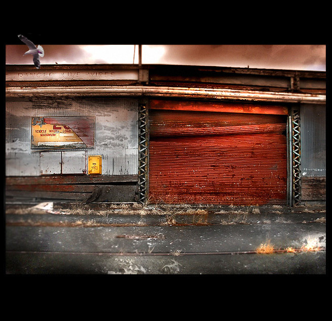
| Very cool color tones in this photo and some really cool overall vibes. Well done! |
|
| Photographer found comment helpful. |
|
|
01/04/2007 07:17:06 PM |
Well three things that I dislike about this shot.
1. The black top and bottom just don´t make sense to me, don´t really care for them.
2. The seagull looks totally fake and out of place, don´t get why you put it there.
3. The selective blurring, especially on the left side of the photo are not making this a better photo in my opinion.
I do like the grain and coloring and the look of the image though and voted a 6 in spite of all three issues I have with this shot. |
|
| Photographer found comment helpful. |
|
|
01/04/2007 05:19:09 PM |
| This is my favorite type of editing, first excellant choice of a place to shoot, 2nd the editing is right on. Is this like an urban acid type? Great work. |
|
| Photographer found comment helpful. |
|
|
01/02/2007 03:00:24 PM |
| i love the image, could do without the bird, tho. |
|
| Photographer found comment helpful. |
|
|
01/01/2007 09:26:58 AM |
| Excellent post processing and a nicely seen and captured basic photo to begin with. |
|
| Photographer found comment helpful. |
|
|
12/31/2006 07:04:42 PM |
Do not appreciate the processing... Sorry.
TC |
|
| Photographer found comment helpful. |
|
|
12/31/2006 02:47:50 PM |
| Looks a little cut and paste to me. |
|
| Photographer found comment helpful. |
|
|
12/30/2006 12:14:29 PM |
| had preferred not to include the seagull. OOF area at left distracts a bit |
|
| Photographer found comment helpful. |
|
|
12/30/2006 01:13:03 AM |
| I like it except for the black smudges near the bottom. I'm not voting but if I were, I'd give your photo a 9. |
|
| Photographer found comment helpful. |
|
|
12/29/2006 03:57:49 PM |
| the border draws my attention away from the pic |
|
| Photographer found comment helpful. |
|
|
12/29/2006 03:06:40 PM |
| this is a very nice image. love the desolate lonesome feeling this evokes but the bird just does not fit here for me. |
|
| Photographer found comment helpful. |
|
|
12/29/2006 01:58:00 PM |
|
| Photographer found comment helpful. |
|
|
12/29/2006 07:45:30 AM |
| It's dilapidated all right, but the High Definition has smothered all that lovely patina and it's ended up being dreamlike and surreal, and not gritty or harsh at all. The blur also makes it difficult to see what's going on in terms of perspective. I can't make out if the "vehicle wheel" sign is in the distance or part of the wall alongside the red corrugated iron. |
|
| Photographer found comment helpful. |
|
|
12/29/2006 01:44:28 AM |
| like the photo, but not the border or the random gull |
|
| Photographer found comment helpful. |
|
|
12/29/2006 12:44:29 AM |
| Nice colours and grunge feel. 7 |
|
| Photographer found comment helpful. |
|
|
12/29/2006 12:15:25 AM |
| amazing image... great colors, contrast, and lighting. i like the bird extending into the border... i think the asymmetric border is a little distracting, but it remains a great image! |
|
| Photographer found comment helpful. |
Home -
Challenges -
Community -
League -
Photos -
Cameras -
Lenses -
Learn -
Help -
Terms of Use -
Privacy -
Top ^
DPChallenge, and website content and design, Copyright © 2001-2025 Challenging Technologies, LLC.
All digital photo copyrights belong to the photographers and may not be used without permission.
Current Server Time: 03/10/2025 10:08:09 PM EDT.