| Author | Thread |
|
|
01/05/2007 12:06:06 PM |
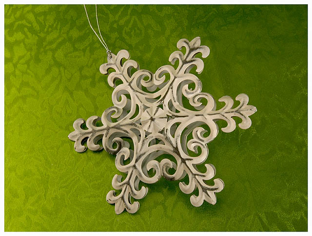
| i wish the background could be even MORE prominent, to emphasize the intersection of the patterns by both the subject and the paper. the color is great. |
|
 Photographer found comment helpful. Photographer found comment helpful. |
|
|
01/03/2007 01:03:00 PM |
| I personally love how the background compliments the color of the ornament - excellent color contrast. For my personal taste, I would like to have seen more sharper detail on the ornament (as far as voting in a challenge). And if you were wanting to put more emphasis on the ornament, I would have done some cropping on the left - the lighter background draws away from the ornament. I like it! |
|
| Photographer found comment helpful. |
Comments Made During the Challenge  |
|
|
01/02/2007 12:33:43 PM |
|
| Photographer found comment helpful. |
|
|
01/01/2007 06:44:30 AM |
| Nice. I only feel a plain background could have worked better rather than this texture |
|
| Photographer found comment helpful. |
|
|
12/30/2006 10:25:31 PM |
| Nice. I'd have removed the string. |
|
| Photographer found comment helpful. |
|
|
12/29/2006 02:57:52 AM |
| Patterns are evident; would be nice to see the ornament pop. |
|
| Photographer found comment helpful. |
|
|
12/28/2006 05:17:45 AM |
| patterns of star and carpet(?) match very well. good color and lighting. composition a bit too centered. still, a ribbon candidate |
|
| Photographer found comment helpful. |
|
|
12/27/2006 02:56:15 PM |
| neat idea, but the string is very distracting.... |
|
| Photographer found comment helpful. |
Home -
Challenges -
Community -
League -
Photos -
Cameras -
Lenses -
Learn -
Help -
Terms of Use -
Privacy -
Top ^
DPChallenge, and website content and design, Copyright © 2001-2025 Challenging Technologies, LLC.
All digital photo copyrights belong to the photographers and may not be used without permission.
Current Server Time: 03/12/2025 10:50:12 AM EDT.