| Author | Thread |
|
|
01/05/2007 11:52:48 AM |
i thought this shot would have done better with the bottom 1/3 cropped off. the dynamics of the light against the wrapper on the top 2/3 are less stimulating against the "dullness" of the bottom. a bit more post-processing to emphasize the brilliance of the wrappers would have helped too.
i do think this was better than your 5.11 score, tho... |
|
Comments Made During the Challenge  |
|
|
01/02/2007 10:57:38 AM |
|
|
|
01/02/2007 05:38:05 AM |
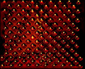
| this photo lack the contrast.. everthing seems to flat. |
|
 Photographer found comment helpful. Photographer found comment helpful. |
|
|
12/29/2006 07:47:35 AM |
| to you too...! excellent pic |
|
| Photographer found comment helpful. |
|
|
12/29/2006 03:03:41 AM |
| Good pattern, but appears as if it's leaning to the right. |
|
|
|
12/28/2006 12:48:13 PM |
| like the pattern but would have liked to have seen it clearer |
|
| Photographer found comment helpful. |
|
|
12/27/2006 03:37:02 PM |
| Looks tilted. Could use some more light. Good pattern. |
|
| Photographer found comment helpful. |
|
|
12/27/2006 01:33:30 PM |
| I like it. The lighting is great and it definitely makes for an interesting, non-traditional pattern. |
|
| Photographer found comment helpful. |
|
|
12/27/2006 12:32:50 PM |
| And happy new year to you! 9 |
|
| Photographer found comment helpful. |
|
|
12/27/2006 07:28:45 AM |
| Nice idea - but it needs some contrast. And I would rather be without the background in the top right corner. |
|
| Photographer found comment helpful. |
Home -
Challenges -
Community -
League -
Photos -
Cameras -
Lenses -
Learn -
Help -
Terms of Use -
Privacy -
Top ^
DPChallenge, and website content and design, Copyright © 2001-2025 Challenging Technologies, LLC.
All digital photo copyrights belong to the photographers and may not be used without permission.
Current Server Time: 03/14/2025 09:26:38 AM EDT.