| Author | Thread |
Comments Made During the Challenge  |
|
|
01/09/2007 08:47:36 PM |
|
 Photographer found comment helpful. Photographer found comment helpful. |
|
|
01/09/2007 04:26:17 PM |
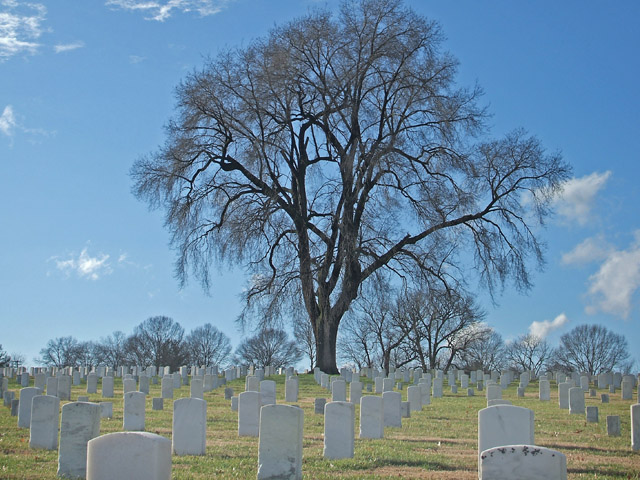
| Seems to lack decent contrast; no blacks, and the emphasis of shapes would require that to my eye. In general, its over-exposed, which removes the impact of the colours from the image. |
|
| Photographer found comment helpful. |
|
|
01/09/2007 12:04:42 PM |
Nice idea overall. I think it would be stronger if you had included the very top of the tree and even a little space above it. You have a nice blue sky and clouds to work with. A polarizer could add some pop to the clouds and deepen that blue some (if you want - you might like the lighter blue). Something about the grave markers seems flat. Appears that there are some shadows so I'm not sure why I'm getting that impression. Anyway...
Did you play with saturation, contrast, and shadow/highlights any? For the most part this is a photo that captures a place and time ok. To do well in challenges will require making the image have some soul, something to make the viewer feel like they are looking at photographic "art" rather than a straightforward image (I avoid the snapshot term here because it's obvious you put some thought into the composition).
This doesn't happen to be the Fredericksburg battlefield cemetary, is it? Looks vaguely familiar. :D Best of luck to you in the challenge. |
|
| Photographer found comment helpful. |
|
|
01/09/2007 11:41:55 AM |
| You may have been going for the blue cast, but think it could be improved by contrasting the white stones against the blue sky more. |
|
| Photographer found comment helpful. |
|
|
01/09/2007 11:35:33 AM |
| Nice. The tree isn't centered perfectly, I think it would have been awsome if there was a way you could get this shot with the grave markers lined up in rows like they do, but I really like this idea. The title gives a sense of comfort as well. |
|
| Photographer found comment helpful. |
|
|
01/08/2007 10:43:23 AM |
| Nice centered composition; I like the fine detail in the tree. A bit more contrast may make it better. |
|
| Photographer found comment helpful. |
|
|
01/06/2007 03:08:52 AM |
| This is good, but I think it could have been greatly enhanced by some Brightness/Contrast treatment or a colour saturation twizzle. |
|
| Photographer found comment helpful. |
|
|
01/06/2007 12:05:19 AM |
|
| Photographer found comment helpful. |
|
|
01/05/2007 08:55:34 PM |
|
| Photographer found comment helpful. |
|
|
01/04/2007 10:40:19 AM |
|
| Photographer found comment helpful. |
|
|
01/03/2007 04:47:00 PM |
| A little over-exposed for my liking, but I like the shot otherwise. Had there been a little more contrast, it would have had an 8 from me. Gave it a 6. |
|
| Photographer found comment helpful. |
|
|
01/03/2007 12:38:43 PM |
|
| Photographer found comment helpful. |
|
|
01/03/2007 04:47:34 AM |
|
| Photographer found comment helpful. |
|
|
01/03/2007 03:32:27 AM |
| Very nice depth and symetry |
|
| Photographer found comment helpful. |
Home -
Challenges -
Community -
League -
Photos -
Cameras -
Lenses -
Learn -
Help -
Terms of Use -
Privacy -
Top ^
DPChallenge, and website content and design, Copyright © 2001-2025 Challenging Technologies, LLC.
All digital photo copyrights belong to the photographers and may not be used without permission.
Current Server Time: 03/11/2025 02:13:10 PM EDT.