| Author | Thread |
Comments Made During the Challenge  |
|
|
01/09/2007 11:12:40 PM |
|
|
|
01/09/2007 10:29:43 PM |
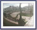
| This doesn't show the fence enough, and is a little too dark and blurry for my taste. |
|
|
|
01/09/2007 01:30:42 PM |
|
|
|
01/09/2007 12:21:08 PM |
|
|
|
01/08/2007 10:08:24 PM |
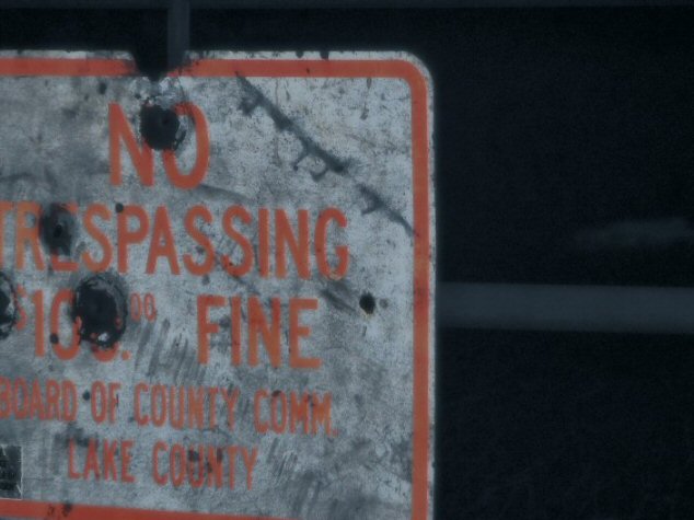
| The implied textures and details of this poor battered sign are very dramatic The focus the way it is makes me feel there should be something in the background as the focus. The crop is great, too, reminds me of comic books. |
|
|
|
01/04/2007 05:42:06 PM |
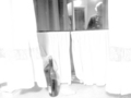
| I want to see more of the fence ... also not very sharp |
|
|
|
01/04/2007 01:56:42 PM |
| Very blurred, crooked verts/horizontals, unseen fence. |
|
|
|
01/04/2007 01:03:35 PM |
| more a sign than a fence, |
|
|
|
01/03/2007 02:27:03 PM |
| The focusing missed, and I'm not sure if that is the fence on the right side of the frame or what? |
|
|
|
01/03/2007 02:08:24 PM |
| I am unpersuaded by this photo...it feels like an "accidental" shot that was supposed to capture more of the sign and didn't quite focus correctly. Nice try, of course! |
|
|
|
01/03/2007 01:54:13 PM |
| where is the fence, where is the light? a 2 |
|
|
|
01/03/2007 11:45:12 AM |
| It's a sign, but not really a fence; not sure where this one was going. |
|
Home -
Challenges -
Community -
League -
Photos -
Cameras -
Lenses -
Learn -
Help -
Terms of Use -
Privacy -
Top ^
DPChallenge, and website content and design, Copyright © 2001-2025 Challenging Technologies, LLC.
All digital photo copyrights belong to the photographers and may not be used without permission.
Current Server Time: 03/13/2025 11:08:02 PM EDT.