| Author | Thread |
|
|
11/18/2003 02:44:16 AM |
Greetings from the critique club.
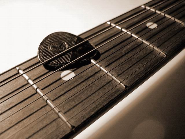
The first thing I noticed when I saw your photo (during the voting) was the composition. I�m a fan of diagonals and the angle you�ve chosen for this image is great. I especially like the placement of the pick. How it�s just above horizontal center and to the left of vertical center. I feel it adds a sense of stability to the strong diagonal lines.
I feel that the choice of sepia tone works well in this instance. I feel that a color version of this shot would have taken away from the simple lines and composition.
The light is coming from an interesting angle, in that it casts some wonderful shadows from the strings and the light glinting off lines on the pick really emphasize the texture.
I like the depth of field you�ve chosen. Not so shallow that it completely obscures the strings in the background, but just enough to give the shot some depth.
The following is strictly my opinion. In a controlled, digital studio shot such as this one, lens flare should be non-existent. The photographer has the ability to position the light anywhere he/she wants it and then review the image to see if there are any anomalies. In the lower right hand corner you have (what appears to be) some lens flare. If you weren�t using one already, a lens hood may have helped reduce the chance of lens flare in this shot. One other thing I noticed is a bit of digital noise in the lower right hand corner, which is a bit distracting, but not anything too major.
I hope this helps,
Quadrajet
|
|
Comments Made During the Challenge  |
|
|
11/11/2003 05:15:12 PM |
| Nice idea - the pick is at rest and the way it holds the string arrests the music... I like the diagonal composition. Wish it were sharper. |
|
|
|
11/11/2003 11:57:41 AM |
|
|
|
11/10/2003 07:26:29 PM |
| Nice. I love how you're not afraid to get close to your subject and explore the intricacies and flaws--the worn edges of the pick and the dust collecting around the frets. I admire your courage: you get a 10. |
|
|
|
11/07/2003 06:40:28 AM |
| Nice macro... I prefer the top-left to bottom-right diagonal though. I think most people find it more pleasing to follow that line, as it is the way we are accustomed to read. Bit too much noise in the bottom-right corner... did you try NeatImage? Other than that I like your lighting. 6 |
|
|
|
11/06/2003 05:12:41 PM |
| This is a very nice image. I like the shalow dof, the composition, and the light. The spot in the lower right hand corner is a bit distracting though. |
|
|
|
11/06/2003 04:38:35 PM |
| Emotive! Probably due to the silence of my own guitar... |
|
|
|
11/06/2003 12:50:59 PM |
|
Home -
Challenges -
Community -
League -
Photos -
Cameras -
Lenses -
Learn -
Help -
Terms of Use -
Privacy -
Top ^
DPChallenge, and website content and design, Copyright © 2001-2025 Challenging Technologies, LLC.
All digital photo copyrights belong to the photographers and may not be used without permission.
Current Server Time: 03/12/2025 08:06:35 PM EDT.