| Author | Thread |
Comments Made During the Challenge  |
|
|
01/16/2007 06:44:24 AM |
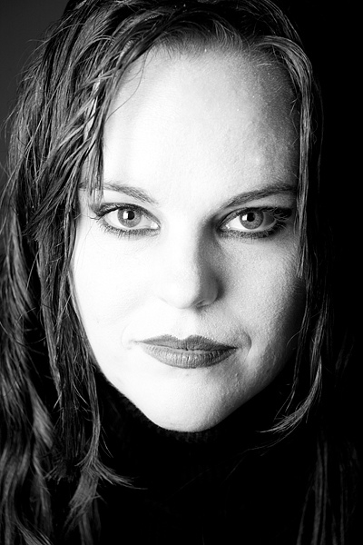
| Highlights are way too blown out for my liking; it looks like the face is covered with white face paint. ;>þ |
|
|
|
01/15/2007 04:26:47 PM |
| Lighting from the left seems too harsh for me. |
|
|
|
01/14/2007 08:33:13 PM |
|
 Photographer found comment helpful. Photographer found comment helpful. |
|
|
01/13/2007 02:21:54 PM |
|
|
|
01/13/2007 08:43:13 AM |
| Too much title for a portrait, just for my prefs. Not changing my score, though. |
|
|
|
01/12/2007 03:39:04 PM |
| I'm sure you realise by now the lighting is too harsh across her cheek, which has lost detail in her face. Tricky stuff lighting :( |
|
|
|
01/12/2007 03:30:54 PM |
| Nice ... a little blown out in the highlights dept. for my taste though. |
|
|
|
01/12/2007 03:21:51 PM |
| i that think the face is overexposed |
|
|
|
01/11/2007 06:27:03 PM |
| I love the look you have achieved with the contrast - very dramatic! |
|
| Photographer found comment helpful. |
|
|
01/11/2007 05:17:20 PM |
| Face is too blown out for me. |
|
|
|
01/11/2007 04:31:52 PM |
| The highlights are a bit blown out on this IMHO. Would be a lot nice if they were toned down a touch. |
|
|
|
01/11/2007 11:52:46 AM |
| too much burned the high lights 6 |
|
|
|
01/11/2007 02:30:51 AM |
|
|
|
01/10/2007 03:37:33 PM |
| Over exposed the face. You've lost all the texture. |
|
|
|
01/10/2007 02:29:32 PM |
| Very attractive framing, but the face feels too washed out to persuade me. |
|
| Photographer found comment helpful. |
|
|
01/10/2007 10:08:11 AM |
| White seems over blown to me IMHO. |
|
|
|
01/10/2007 09:13:10 AM |
|
| Photographer found comment helpful. |
|
|
01/10/2007 08:15:43 AM |
| Makeup - too much pasty white. nice photo though |
|
| Photographer found comment helpful. |
|
|
01/10/2007 05:11:43 AM |
same here!! ...
great shot ... love the sharp contrast between the face and the black 'background' ... this is certainly a photograph that gets better and better the more i look at it ... =8 |
|
| Photographer found comment helpful. |
|
|
01/10/2007 01:35:50 AM |
| I think the face is a little overexposed. |
|
Home -
Challenges -
Community -
League -
Photos -
Cameras -
Lenses -
Learn -
Help -
Terms of Use -
Privacy -
Top ^
DPChallenge, and website content and design, Copyright © 2001-2025 Challenging Technologies, LLC.
All digital photo copyrights belong to the photographers and may not be used without permission.
Current Server Time: 03/12/2025 01:41:29 AM EDT.