| Author | Thread |
|
|
01/23/2007 12:45:36 PM |
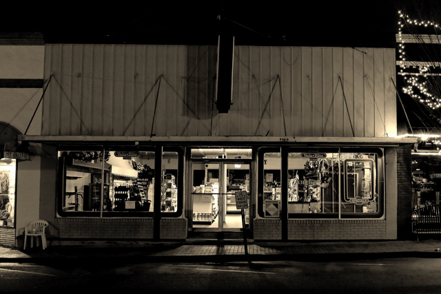
| Nice composition and sepia filter. However, I think the building is not parallel to the horizon, If you take a ruler out and place it on the roof top, it seems to tip downward towards the right side. This can be easily correct with photoshop CS2. Go to Filter-->Distort-->lens correction |
|
 Photographer found comment helpful. Photographer found comment helpful. |
|
|
01/15/2007 10:08:25 AM |
| Very nice b&w photograph, perhaps a tighter crop around the store would make a better impression. IMHO the space around and especially above the store do not add anything to the concept. |
|
| Photographer found comment helpful. |
Comments Made During the Challenge  |
|
|
01/12/2007 01:39:01 PM |
| Lovely old country store! Definitely looks closed. |
|
| Photographer found comment helpful. |
|
|
01/11/2007 09:49:18 PM |
|
| Photographer found comment helpful. |
|
|
01/08/2007 05:48:32 PM |
| I think this one might have been more striking with tighter vertical crops at the left and right to draw focus more squarely on the very warmly illuminated shop. I might also have used a perspective crop to "straigten" the vantage (which appears a little crooked to the right). Overall, a 6 from me. |
|
| Photographer found comment helpful. |
|
|
01/08/2007 12:53:50 PM |
| Cool shot. I like the BW. |
|
| Photographer found comment helpful. |
|
|
01/08/2007 01:40:36 AM |
|
| Photographer found comment helpful. |
Home -
Challenges -
Community -
League -
Photos -
Cameras -
Lenses -
Learn -
Help -
Terms of Use -
Privacy -
Top ^
DPChallenge, and website content and design, Copyright © 2001-2025 Challenging Technologies, LLC.
All digital photo copyrights belong to the photographers and may not be used without permission.
Current Server Time: 03/14/2025 09:42:20 AM EDT.