| Author | Thread |
|
|
03/02/2007 04:29:10 PM |
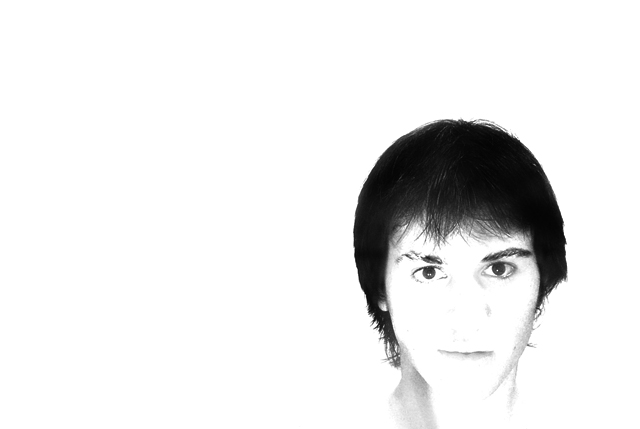
| i like this one, even thought its bright, i think its great.... |
|
 Photographer found comment helpful. Photographer found comment helpful. |
Comments Made During the Challenge  |
|
|
01/15/2007 02:10:47 AM |
| way too over exposed and really grainy. |
|
|
|
01/14/2007 04:22:53 PM |
| Too blown out, but if intentional interesting |
|
| Photographer found comment helpful. |
|
|
01/14/2007 10:41:59 AM |
| I would usually complain about the white background but in this case I think you have chosen well to capture the feeling of the title. I like it. |
|
| Photographer found comment helpful. |
|
|
01/13/2007 10:21:36 AM |
| i like the high key but the fact that the nose is missing bothers me. |
|
| Photographer found comment helpful. |
|
|
01/12/2007 05:21:27 PM |
| I'd like this better if it were framed a little lower so it didn't appear to be a floating head. |
|
| Photographer found comment helpful. |
|
|
01/12/2007 02:43:09 PM |
| Oh yeah ... blown away ... |
|
|
|
01/11/2007 07:45:08 PM |
| too white for me... but I think it was supposed to be white as it is... |
|
|
|
01/11/2007 09:09:47 AM |
really neat concept.
maybe get a better shot tho |
|
| Photographer found comment helpful. |
|
|
01/11/2007 07:11:57 AM |
| I like the composition, however IMO the lighting looses too much detail of teh face. |
|
| Photographer found comment helpful. |
|
|
01/11/2007 03:09:13 AM |
|
|
|
01/10/2007 10:20:53 PM |
| Wow! I like the minimalism of your image, but it's very washed out. I don't know if this was intentional, but it's a bit too washed out for my personal tastes. |
|
| Photographer found comment helpful. |
|
|
01/10/2007 08:39:06 PM |
| i little too blown out for my liking.. lose too many features |
|
|
|
01/10/2007 06:51:51 PM |
| way too much contrast and the higlits are absoulutely blown out... |
|
|
|
01/10/2007 06:35:42 PM |
| whoah...way over exposed. |
|
|
|
01/10/2007 05:30:27 PM |
| I like the simplicity of this photo. Maybe needs more detail burned into the nose region. It appears the model has a nose ring, I would have liked to see more definition. Like the composition. It is an attention getter! |
|
| Photographer found comment helpful. |
|
|
01/10/2007 02:30:46 PM |
| Striking composition, but not persuasive enough because it is so washed out. |
|
| Photographer found comment helpful. |
|
|
01/10/2007 12:37:28 PM |
| I really don't like the blown out highlights (but maybe it's trendy - there are lot's of them in the challenge) |
|
| Photographer found comment helpful. |
|
|
01/10/2007 12:01:09 PM |
| way to overexposed. You don't really see anything other than the air and eyes. It's floating. |
|
| Photographer found comment helpful. |
|
|
01/10/2007 05:56:47 AM |
| to washed out...no details |
|
|
|
01/10/2007 04:57:09 AM |
| For me personally overexposure does not add anything in this image. |
|
| Photographer found comment helpful. |
Home -
Challenges -
Community -
League -
Photos -
Cameras -
Lenses -
Learn -
Help -
Terms of Use -
Privacy -
Top ^
DPChallenge, and website content and design, Copyright © 2001-2025 Challenging Technologies, LLC.
All digital photo copyrights belong to the photographers and may not be used without permission.
Current Server Time: 04/02/2025 04:19:04 AM EDT.