| Author | Thread |
|
|
11/16/2003 08:30:57 AM |
Critique Club
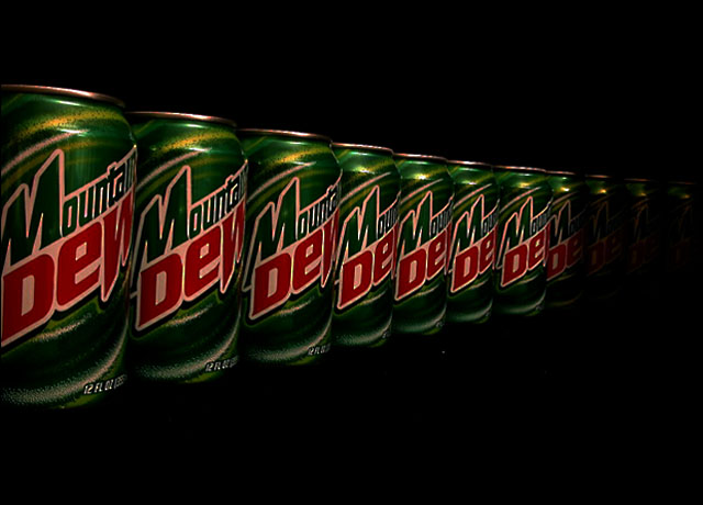
Very orginal. Your biggest flaw here was your lack of lighting, its to dark and it has left you grainy. Also, you have to much red saturation. The white on the cans appears pink, a simple adjustment in editing can correct this.
I feel this does meet the challenge and was also a very refreshing take on it. A little better lighting and this can be a fantastic photo.
|
|
Comments Made During the Challenge  |
|
|
11/04/2003 06:57:35 PM |
| Good concept, but the image looks overly sharpened, and it's too dark for my tastes |
|
 Photographer found comment helpful. Photographer found comment helpful. |
|
|
11/04/2003 05:40:29 PM |
| Nice idea. Good composition. 8. |
|
| Photographer found comment helpful. |
|
|
11/03/2003 07:47:54 PM |
| Good idea, but the shot is too dark and kind of has a red cast to it |
|
| Photographer found comment helpful. |
|
|
11/03/2003 05:51:31 PM |
| would be even better if the white was more white instead of reddish. |
|
| Photographer found comment helpful. |
|
|
11/03/2003 02:58:55 PM |
| There are some men I pity over others. |
|
|
|
11/03/2003 02:06:26 PM |
| *sigh.. i miss mountain dew.. (dentists orders) but that's what happens when you need 12,000 dollars of work on your teeth. TAKE HEED. SODA, THOUGH DELICIOUS, IS EVIL! |
|
|
|
11/03/2003 02:11:10 AM |
| the black backround is fine but the cans could have used some more light, andmaybe a few more to better convey the sense of their infinity. |
|
| Photographer found comment helpful. |
Home -
Challenges -
Community -
League -
Photos -
Cameras -
Lenses -
Learn -
Help -
Terms of Use -
Privacy -
Top ^
DPChallenge, and website content and design, Copyright © 2001-2025 Challenging Technologies, LLC.
All digital photo copyrights belong to the photographers and may not be used without permission.
Current Server Time: 03/12/2025 03:16:00 AM EDT.