| Author | Thread |
|
|
11/14/2003 12:58:58 PM |
| thanks a lot for your helpful comments! |
|
Comments Made During the Challenge  |
|
|
11/11/2003 05:23:54 PM |
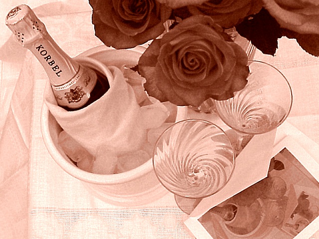
| Cool - I like the repetition of the image in the card and therepetition of the card in the card and...very imaginative. Wish the background was solid - no folds of cloth, and I wonder what it would be like with a darker background. I realize you are going for the white table cloth look, but perhaps your subject would show up better if you played around with it |
|
 Photographer found comment helpful. Photographer found comment helpful. |
|
|
11/11/2003 03:57:32 PM |
Cool effect with the card. I wanna know how ya did that. I think that this scene is a little busy though. Also the color tone here doesn't do it for me personally. Take a couple of elements out and make the colors more natural and I would really like this one!
TC |
|
| Photographer found comment helpful. |
|
|
11/11/2003 01:23:29 PM |
| good filter. i'm not too crazy about the whole dinnerware setup (centerpieces aren't meant to be photographed), but you've got a good sense of design. This photo needs more clarity, better resolution. Textures go a long way when applying monotone filters. Texture goes a long way regardless, actually. |
|
| Photographer found comment helpful. |
|
|
11/11/2003 07:47:09 AM |
| the perspective is weird and I don't like the pink tone. but that may be my personal taste ;) |
|
| Photographer found comment helpful. |
|
|
11/09/2003 06:37:57 PM |
|
| Photographer found comment helpful. |
|
|
11/05/2003 03:35:59 AM |
| Subtle pink is excellent. Very detailed and well thought out picture. |
|
| Photographer found comment helpful. |
Home -
Challenges -
Community -
League -
Photos -
Cameras -
Lenses -
Learn -
Help -
Terms of Use -
Privacy -
Top ^
DPChallenge, and website content and design, Copyright © 2001-2025 Challenging Technologies, LLC.
All digital photo copyrights belong to the photographers and may not be used without permission.
Current Server Time: 03/12/2025 02:54:56 AM EDT.