| Author | Thread |
|
|
08/11/2007 11:55:29 PM |
| Very creative, and the perspective is perfect. Plus you have the added excitement of the diagonal. Just darned great design and a very creative idea! |
|
 Photographer found comment helpful. Photographer found comment helpful. |
|
|
06/25/2007 10:28:07 AM |
brilliant concept! fave!
grab for grab! heh. |
|
| Photographer found comment helpful. |
|
|
06/09/2007 02:44:19 AM |
just happened upon this again and it's so funny the difference a monitor makes (im not at home). The selective saturation is blatantly obvious on this one! lol. so I bet my old comment was a little odd to you but on my home monitor it was barely noticeable. this one is a way worse monitor too... might be time for some calibration.
with that said, still love the shot. don't like the selective saturation. |
|
| Photographer found comment helpful. |
|
|
06/06/2007 01:47:23 PM |
| I like the shot it is really quite illustrative a nice job of staging something thoughtful |
|
| Photographer found comment helpful. |
|
|
05/07/2007 08:59:53 AM |
|
|
|
05/04/2007 07:20:27 AM |
|
|
|
01/22/2007 09:25:03 AM |
| Very clever and interesting image. Congrats on your top 20! |
|
| Photographer found comment helpful. |
Comments Made During the Challenge  |
|
|
01/21/2007 02:36:17 PM |
| I don't love the way you desaturated the photo. I realize why you did it and it makes sense to me, but more subtle would have been better. Anyhow, great job I really like it. |
|
| Photographer found comment helpful. |
|
|
01/21/2007 12:21:45 AM |
|
|
|
01/20/2007 04:25:54 PM |
| hahahahaha!! I'd give this a 10 but i don't find the posing realistic although i do like the booty/hip grab here. You get a 9 ;) |
|
| Photographer found comment helpful. |
|
|
01/20/2007 09:23:29 AM |
|
|
|
01/18/2007 06:15:39 PM |
|
|
|
01/18/2007 08:47:05 AM |
| Love it. Everything about it. |
|
|
|
01/17/2007 05:39:47 PM |
|
|
|
01/17/2007 03:42:30 AM |
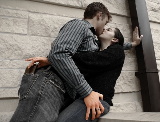
One of the better entries I think. Original. I don't know who looks worse, the girl stealing the wallet or the guy grabbing a big handful! LOL.
Only problem I have is something seems a bit weird with the saturation... like the front hands are more saturated than the rest of their skin. I guess this is meant to draw attention? But to me it just looks odd. |
|
| Photographer found comment helpful. |
|
|
01/16/2007 10:17:46 PM |
| Nice shot, and like the humor too. The diagonal works very well. |
|
| Photographer found comment helpful. |
|
|
01/16/2007 07:58:06 PM |
|
|
|
01/16/2007 07:10:09 PM |
| Good on topic, well made...emphasizing the hands (maybe a little to much, the faces are bit gray). Like it though. |
|
| Photographer found comment helpful. |
|
|
01/16/2007 04:56:37 PM |
| yea well a little cynical but arent we all |
|
|
|
01/16/2007 02:29:50 PM |
| this remember me something....... |
|
|
|
01/16/2007 06:39:43 AM |
| Daring take on the challenge. I wonder if you're getting blasted for this one. LOL |
|
|
|
01/16/2007 12:59:16 AM |
| great shot with the movement and lean .. love the delicate way she's reaching for his wallet ... |
|
| Photographer found comment helpful. |
|
|
01/15/2007 10:58:35 PM |
| You can never trust them! |
|
|
|
01/15/2007 02:30:43 PM |
A great concept well executed, but poorly lit comes off flat.
( 5 ) |
|
| Photographer found comment helpful. |
|
|
01/15/2007 11:39:54 AM |
| Well-posed. I like the level of saturation. |
|
| Photographer found comment helpful. |
|
|
01/15/2007 10:33:36 AM |
| LOL, brilliant idea. selective desat doesn't add IMO |
|
| Photographer found comment helpful. |
|
|
01/15/2007 03:52:48 AM |
AHHHHHH there's always a catch ain't there. My wife gets mine as soon as I get it, Im terrible with money, I blow it all on camera gear.
Like the subtle colours here and the plot is cool. |
|
| Photographer found comment helpful. |
|
|
01/15/2007 03:17:27 AM |
The inconsistent desat. keeps making me tilt my head and look again. I wonder if you could have achieved your goal (drawing the eyes) in a different way...
Meets Challenge: 1/1
Lighting: 1/2
Focus: 1/2
Creativity: 1/2
Aesthetics: 2/3 |
|
| Photographer found comment helpful. |
|
|
01/15/2007 02:04:46 AM |
| lol i dont see much of a "battle", the fadeing of saturated to de-sat'd doesn't really help this i dont think. |
|
| Photographer found comment helpful. |
|
|
01/15/2007 12:58:11 AM |
|
|
|
01/15/2007 12:45:02 AM |
| I like the idea, but don't care much for the color of their faces. |
|
| Photographer found comment helpful. |
|
|
01/15/2007 12:38:43 AM |
| Hah! Great idea, well executed. |
|
|
|
01/15/2007 12:14:17 AM |
| Now this is funny! It looks like the two hands have more color than the rest of the photo...It really brings your eyes into the hands. Nice, original idea. |
|
| Photographer found comment helpful. |
Home -
Challenges -
Community -
League -
Photos -
Cameras -
Lenses -
Learn -
Help -
Terms of Use -
Privacy -
Top ^
DPChallenge, and website content and design, Copyright © 2001-2025 Challenging Technologies, LLC.
All digital photo copyrights belong to the photographers and may not be used without permission.
Current Server Time: 03/12/2025 05:54:55 PM EDT.