| Author | Thread |
Comments Made During the Challenge  |
|
|
11/11/2003 08:07:21 PM |
| I think this picture is a little bit too busy the lightning is a little flat so the stuff kinda blends into one another, would like too see it in b/w spot edited |
|
 Photographer found comment helpful. Photographer found comment helpful. |
|
|
11/10/2003 07:59:57 PM |
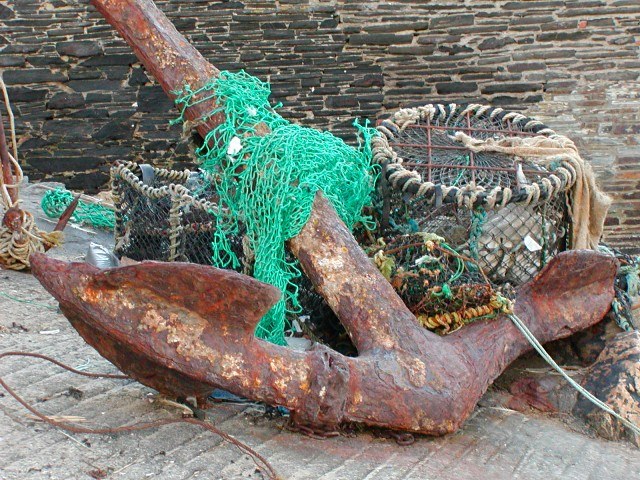
| Too much color. Let's rephrase....get that green net out of the picture. |
|
| Photographer found comment helpful. |
|
|
11/08/2003 12:49:30 PM |
| I personally don�t like the green net. Might have worked better as a black and white. |
|
| Photographer found comment helpful. |
|
|
11/06/2003 06:04:49 PM |
| Somehow too pale, isn't it? |
|
| Photographer found comment helpful. |
|
|
11/06/2003 02:28:49 PM |
| nice composition and excellent texture contrasts. for my feeling, the colors appear bit desaturated and feel if they were richer the overall image would be better. |
|
| Photographer found comment helpful. |
|
|
11/05/2003 12:23:25 PM |
I think this photograph would benefit from a tighter crop. Try ending the picture without showing the entire anchor. The way it is now the image seems to spill off of the photo. Otherwise a very interesting photo.
-Scocchio |
|
| Photographer found comment helpful. |
|
|
11/05/2003 12:57:24 AM |
| find the green net over top steals the show and has no meaning. the anchor is beautiful |
|
| Photographer found comment helpful. |
Home -
Challenges -
Community -
League -
Photos -
Cameras -
Lenses -
Learn -
Help -
Terms of Use -
Privacy -
Top ^
DPChallenge, and website content and design, Copyright © 2001-2025 Challenging Technologies, LLC.
All digital photo copyrights belong to the photographers and may not be used without permission.
Current Server Time: 04/27/2025 12:35:45 PM EDT.