| Author | Thread |
|
|
11/18/2003 11:39:24 PM |
Greatings from the Critique CLub
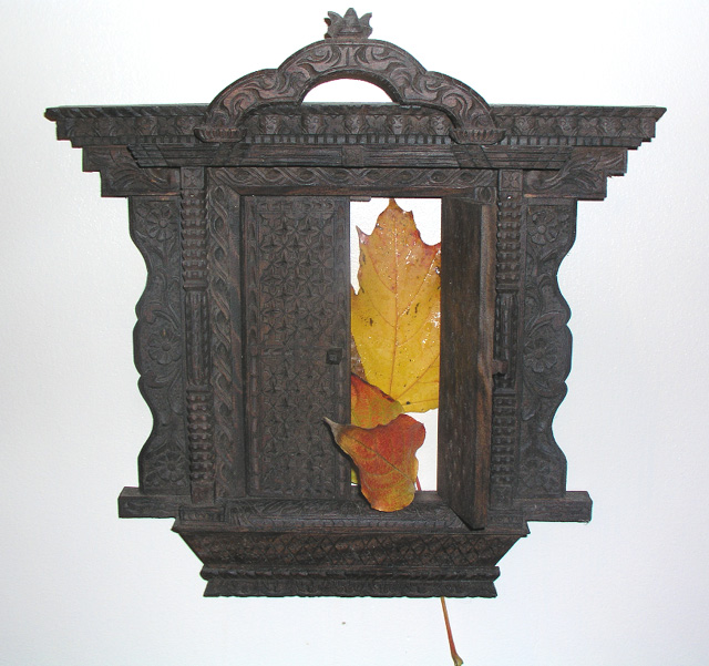
This was one of the more original images submitted for this challenge.
It is a very good concept. Some things I would change are to not have the leaf stick out the bottom.
Create more contrast by using different lighting techniques.
I do like the idea of having this with a high key (all white) background but the main object lacks depth and definition.
It is also not straight in the frame and the background is not even.
I like how the one leaf wraps around the closed door. Your use of limited colour is one of the strong points here.
I hope this helps.
JC
|
|
 Photographer found comment helpful. Photographer found comment helpful. |
Comments Made During the Challenge  |
|
|
11/11/2003 08:11:23 PM |
| Cool stuff thin it would have worked better on a darker background and the light coming from one side |
|
| Photographer found comment helpful. |
|
|
11/11/2003 03:29:23 AM |
| why. to go into greater detail as requested: I don't know what this photograph seeks to do. it looks to be the face of an old cuckoo clock or something of that nature, with leaves. no background, just pure white. i'm so confused by your choice, and yet i can't be carried away by its beauty or its design, because it's not beautiful and it's poorly designed. the stem's showing, the colors clash, there's no lighting, no spacial recognition, no grasp of texture. play around with this subject more, but here's the trick: don't be afraid to step outside yourself. you obviously are very creative (hopefully you know what the setup of this picture means), so seek to convey your meaning through unique design. if the setup in fact has no meaning, you have to work extra hard to make people think it has meaning. i can't find the connection between leaves and clocks off the top of my head, but maybe you can if you were to explore your subject more creatively through the lens of your camera. |
|
| Photographer found comment helpful. |
|
|
11/10/2003 10:46:24 PM |
| Creative arrangement. I especially like the leaf stem sticking out of the bottom. The white background is effective, but making the doorway a bit darker and adding a little sharpening would help bring out its nice textures. |
|
| Photographer found comment helpful. |
|
|
11/08/2003 03:19:13 PM |
| The lighting looks a little washed out and the stem at the bottom is distracting. |
|
| Photographer found comment helpful. |
|
|
11/08/2003 02:58:52 PM |
|
|
|
11/07/2003 08:31:50 AM |
| NIce idea and good composition. The light on the leaf and upper right corner a little distracting. |
|
| Photographer found comment helpful. |
|
|
11/06/2003 08:48:16 PM |
| nice... unique, good detail. |
|
|
|
11/06/2003 06:31:17 PM |
| Looks too light. The stem of the leaf hanging out the bottom is a little distracting as well. Also, the lighting seems a little too direct. Shadows would add a bit of depths and dramatics to the shot. Also, your subject is a little crooked. |
|
|
|
11/06/2003 02:51:29 PM |
| like the main subject very much, nice lighting and detail....Iike the idea of the colors of the leaves in the doorway to break up the white BG but do not feel that they might have been the best item to have used. the long stem at the bottom from the one leaf is very distracting and feel it should have been cut prior to taking the shot. May be more leaves would have helpe, maybe less? him it just does't seem to jell. |
|
| Photographer found comment helpful. |
|
|
11/06/2003 11:32:58 AM |
the white background isn't consistent - its darker in some places than others and it looks off...
I think this may look better on a different angle
|
|
| Photographer found comment helpful. |
|
|
11/05/2003 05:35:57 PM |
| neat - i like the way the leaf has what looks like an arm reaching in through the door. maybe the stem at the bottom should have been cut off to better create the idea that this door was some kind fo portal. also, the whole thing is slanted a little, and the detail on the door-thingy is a bit dull. |
|
| Photographer found comment helpful. |
Home -
Challenges -
Community -
League -
Photos -
Cameras -
Lenses -
Learn -
Help -
Terms of Use -
Privacy -
Top ^
DPChallenge, and website content and design, Copyright © 2001-2025 Challenging Technologies, LLC.
All digital photo copyrights belong to the photographers and may not be used without permission.
Current Server Time: 03/12/2025 03:09:18 PM EDT.